Friction-free is the way to be
A few months ago I fired up Webex Teams at work to check for a message from someone, but what did I see the minute Teams loaded? A giant pop-up message about all the cool new features Webex had added. Yeah, not interested. Annoyingly interrupted by friction, I was on a mission because I had something important to get done—stat!
To make matters worse, there was no way to dismiss this giant eyesore. No button. No “X” at the top right. Nothing. The only option was to click the button that opened the entire message or have it block my screen until who knows when. So, I reluctantly opened the thing, and shut it down immediately. I didn’t read a word on that screen.
This is the kind of thing that frustrates me.
Frankly, so many companies have hit us with marketing and sales content like that over the years that we even close the bright red dialogs that might be important warning messages. At this point, the color red in any easily dismissible pop-up dialog means someone is trying to sell us something we don’t care about or want. Not only do frustrated and annoyed users leave and take their business with them, but they also tell others why they left. No one needs or wants that kind of word-of-mouth campaign out there!
Yet, it’s often more cost-effective to sell to people who already have your product than it is to get new customers. The key is to use low-friction or friction-free design elements for your in-app marketing content.
A little about friction
Friction is anything, any tension that gets between a user and what they’re trying to do. It can be a modal that tells them they need to change their settings for the app to keep working. That’s positive friction and creates a better experience.
But a marketing splash screen talking about a new service that opens when someone is writing an email or editing a document is negative friction. It’s there to help the company sell something, not necessarily help the user in their flow or complete a task. That’s the kind of friction you want to avoid. It completely frustrates the user and it can oftentimes lead to decreased engagement and lost business, depending on the situation.
A better way to reach users
If a message appears at exactly the right moment in exactly the right way and offers me something that could make my life better or my work easier in some way, then I’m willing to at least glance at it. So, tell them what the benefits of buying a new tool or paying for an upgrade are. For instance, the content should explain:
- What does getting a premium version of the product do for them? Maybe it gives them access to all their messages or their complete transaction history.
- Why would buying something more from the company make their lives better or work easier? Maybe if they add video conferencing to their chat app, it will make their employees more productive.
- How does using a tool in the app make them more efficient? Maybe a tooltip lets them know how to buy a new image so they can add it to a graphic they’re creating.
It has to be about the user and what helps them the most.
A look at some industry pros
There are a few companies out there who do it right every time. They know who their users are, what they want, and how to sell more to them.
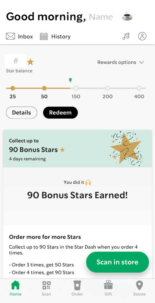
Starbucks: Giving people reasons to buy more … and more often
Starbucks has perfected the act of getting cappuccinos and lattes on the go an art form. Their app is crucial here! They use it to upsell without making people feel like they’re getting a sales pitch. Their promotional content is in strategic locations so it doesn’t interrupt their users:
- In the inbox, messages tell the user what’s new and exciting, and a badge alerts them when they have new ones to read. There’s even an option for them to delete messages if they want to.

- On the home screen, ads tell the user about upcoming promotions and new products, as well as remind them of old favorites. These marketing gems sit below the most important info the user wants to know: How many rewards stars they have.

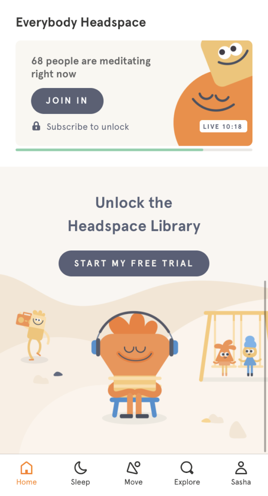
Headspace: Offering tools to find calm in the middle of daily chaos
Headspace is a meditation and mindfulness app. It reminds you to take a break or breathe deeply for a bit, including quick 3-minute meditations to help you relax.
Their in-app marketing is on par with that of Starbucks, but with a few differences. Unlike the Starbucks app, this one has both free and paid content in it. But, like Starbucks, they, too, want to drive up sales and make more revenue. Still, they aren’t slamming their non-paying users with dialogs that pop up all over the place. It would be very anti-Zen if Headspace did that, actually!
They’re smart about how they do things. They use a visual of a lock to alert users to the fact that something is part of the paid product. If they want access, they have to upgrade to get it. There’s no hard sell, no annoying friction, and no guilting someone for not getting a paid subscription. There are simply gentle nudges here and there to encourage people to buy. For them, the home screen is the perfect place for that kind of content. ![]()
 Go further in and the visual of the lock, which was defined on the home screen, lets users know which things are free and which aren’t.
 Slack: Making connecting online more efficient and fun
Slack is a master at connecting people – for work or for play. You can chat with people, set up reminders to look at messages and posts later, and hop on a video call anytime. There’s a price for all this, of course, but they also offer different layers of services.
One of their upsells happens when you hit the limit of posts that are saved in a free account. The message tells you that all you have to do is upgrade your account and you can see the rest of the messages. Simple as that. Just an on-screen notification. No friction or hard sell required.
Hopper: Letting people get real-time updates on travel deals
Hopper is here to help you find affordable prices on flights, hotels, and more. Like other travel apps, they let you do a variety of searches. But they give gentle pushes here and there to get you more engaged and excited about booking your travel.
One of the ways they do it is by highlighting the option to turn on notifications for price changes. 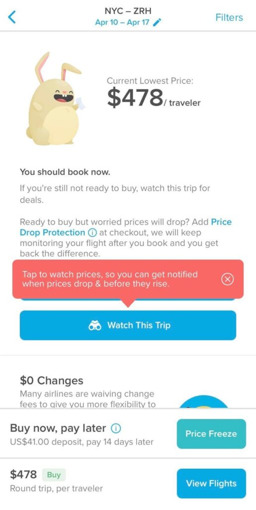
Duolingo: Getting to know users right when they sign up
Another excellent place for marketing content is in the onboarding or registration flow, which is where Duolingo puts it. People are eager to try a new product and they might not know everything about it. You can use this space to ask a few questions so you can find out how they plan to use the app. Later you can show them targeted sales messages that match their interests.
You can also add a little info about how using the product helps them. That’ll spark their interest and enthusiasm.
Check out their user onboarding and registration flows for ideas.
Time to create your own strategy to reduce friction
Every company needs to align its user experience goals with its business goals. You just have to figure out how to build the marketing messages into your design. Try this:
- Do some research.
Find out what your users want to do, what functions and features they use the most, and where they get stuck and could use guidance. - Study analytics to see where you can improve your design.
Explore how effective your onboarding and registration flows are. Those could be areas that need attention and could benefit from marketing messaging that lets the users know how the app benefits them. Find out where tooltips could be useful. Consider what other types of design elements work for your users. - Draft several flows that include low- or no-friction marketing content.
Write those messages like they’re UX content, not marketing content, because they are. As you do for any other content, give your users the info they need when they need it. In this case, tell them what they gain by buying the new tool or paying for a premium plan. - Create prototypes and start testing away.
Find out whether what you did will meet the needs of your users. Run A/B tests and see which versions work best. You can do this to test both the design elements you picked and the content you wrote. - Start with a small launch if you can.
Better to start small and fail sooner than to do a big launch and aggravate a lot of users. - Keep what worked and get rid of the rest.
It’s a win-win
Going back to my experience with Webex Teams earlier, what they could have done instead of hitting me with a pop-up right is include a line about one of their new features: emojis. I’d been feeling a lack of emoji love there (compared to Slack), so having more options could improve my experience. If they had put in some sort of inline message the next time I opened the emoji picker, that would have been perfect!
Also, the next time I record a meeting and my company is reaching its max storage limit would be the ideal time to do an upsell. They could tell me that upgrading gets me more storage space in the Cloud. It’s that simple, really. See my pain point, offer me a solution at an appropriate time, and I’ll go lobby my company for more money to get the upgrade.
It’s a win-win! So, what kinds of friction-free marketing will you put into place? Hop to it. You and your users won’t be sorry.
Sasha A. Rae is a senior UX content designer and strategist. You can connect with her on LinkedIn.
Did you enjoy this blog post? Level up your skills and knowledge in one of our courses. Your career is depending on you!
