
Step 1: Define feature name criteria
First, as a team, we brainstormed a set of criteria this feature’s name would need to abide by. The team included our Product Designer, Product Manager, Senior Director of Content Design, and Manager of Clinical Program Development.
This brainstorm was low-lift. I used a 30-minute time-slot in one of our weekly standing meetings, which was plenty of time to land in a solid place. I started by giving the team some examples of feature naming criteria and explained the importance of defining this criteria ahead of time before we dove into brainstorming ideas.
Some criteria was in flux as it could have been impacted by decisions yet to be made at this point in the design process. For example, we hadn’t yet decided where this feature would live within our app. Regardless, we captured it and planned to revisit once these decisions were made.
Our criteria included:
- Must be unique in the context of other feature names
- If positioning it as a single activity, rather than a section in the main nav, it must be a noun, and no more than 3 words
- If positioning it in the main nav, rather than as a single activity, it must be no more than 1 word, and it can be a noun or verb
- Always referred to in Title Case
- Should highlight the main action being taken by the user
- Should highlight the communal/social aspect of the feature
Why define criteria when certain feature elements were still in flux? It’s crucial to start any feature naming project by agreeing on a set of criteria, so that your decision-making process is steered by some type of objectivity. Otherwise, you may find yourself weeks down the road with many solid options and no way to decide what’s best.

Brainstorm board showing the feature naming criteria as determined by the team before making any naming decisions. View full-size image.
Step 2: Explore concept positioning and name options
At this point in the design process, we had a strong sense of this feature’s basic functionality and capabilities, but there was still plenty of room to finagle details. This was the ideal moment to dig into feature naming, because exploring different positioning options would help us fine-tune some of the feature’s details while they were still malleable.
What we knew so far:
- The feature would function as a communal space to journal, meaning that users would be able to share their own writing entries and view those of others
- We’d guide users with journal prompts, to steer them towards helpful, positive, and practical entries
Alongside our Product Designer, I set aside a few hours to explore three different ways to position this new feature’s concept with name options and supporting copy for each.
This step could have been turned into a larger group exercise or workshop, but due to bandwidth and time constraints, we kept it to a simple pairing. I don’t recommend doing this exercise solo. While it’s possible to brainstorm concepts on your own, I’ve found that it sometimes leaves the rest of the team feeling out of the loop and lacking ownership, two things you want to avoid at all costs when naming a new feature.
Here’s what our positioning options looked like after our first round of brainstorming. We shared this with the broader team for questions and feedback:
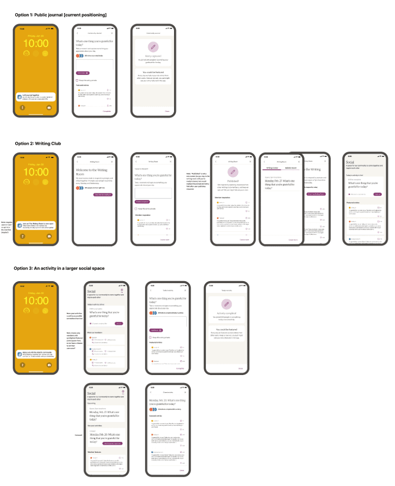 Draft of three options for product positioning. View full-size image.
After gathering the team’s input, we fine-tuned our options, named them, and added supporting copy, including descriptions and push notification examples.
Option A: The Writing Room
This option positioned this feature as a space to enter alongside others and journal a response to the same prompt. Writers can share their response with other writers in the room, or choose to keep it private. They can also save their favorite responses to their shelf to revisit for inspiration later.
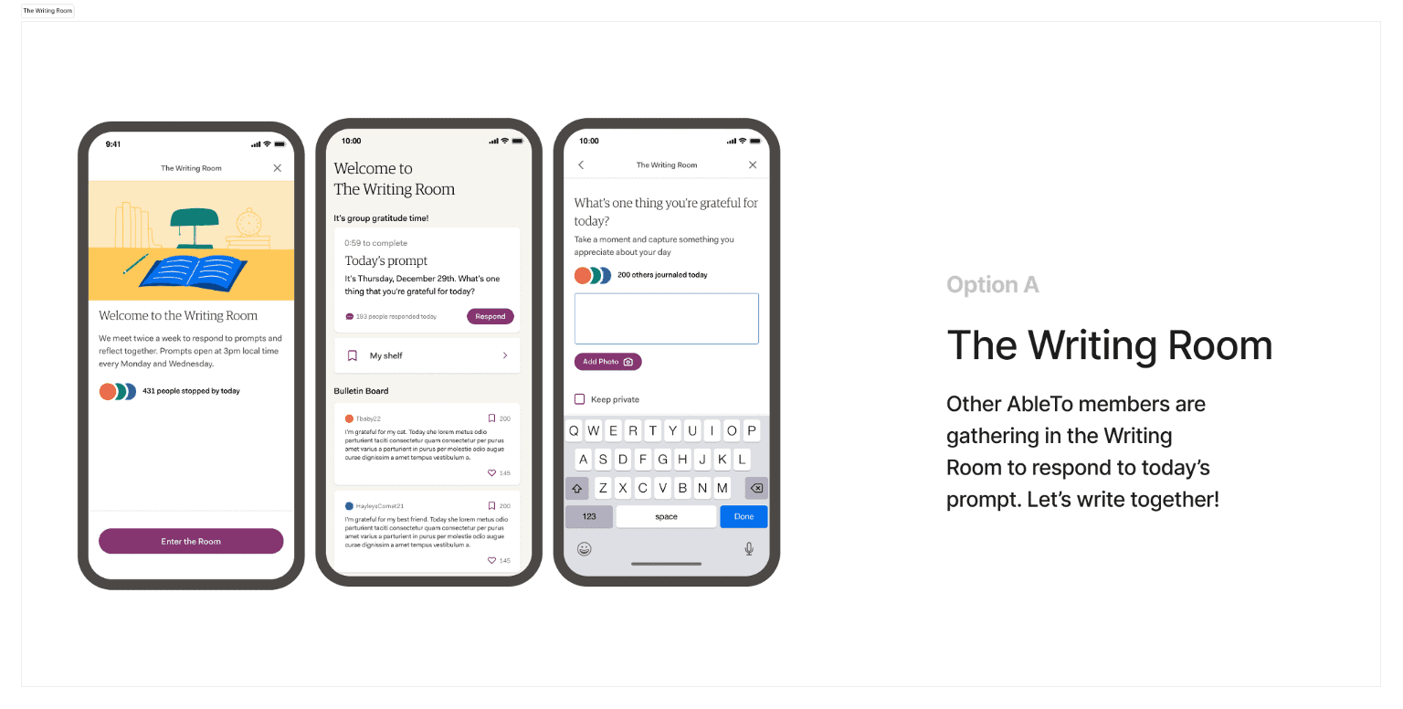 Option A: View full-size image.
Option B: Social Journal
This option positioned the feature as a physical journal, where users can write and publish entries, and share them with others whenever they’d like.
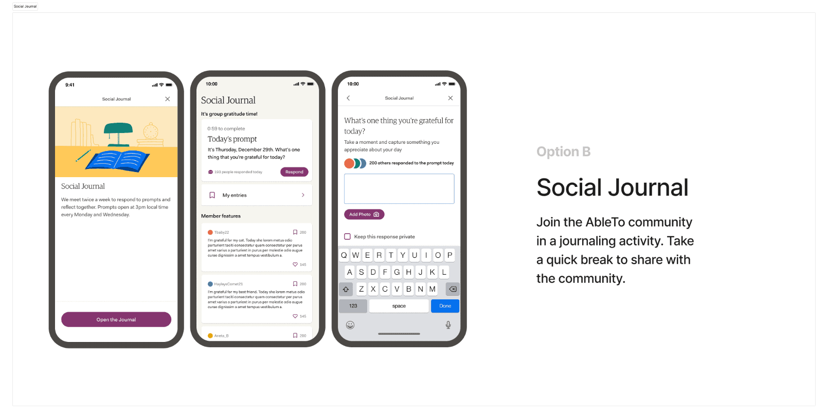 Option B: View full-size image.
Option C: Self Care Collective
Our final option explored the idea of this feature acting as a social platform, where users can explore a feed of other users’ journal content and publish their own. It leaves room for us to offer other community activities within the space, all shared via a user-generated content feed.

Step 3: Gather user feedback, synthesize, and discuss
Once we felt confident in our three options, I designed a user research test on Maze to gather user feedback and explore any existing mental models of the feature concept.
The test
The test started with a 10-second test where we censored any terms within the feature that suggested a certain position.

We followed up with a series of questions to get users’ uninfluenced thoughts on its functionality, learn what words came to mind when thinking about its functionality, and uncover existing mental models.
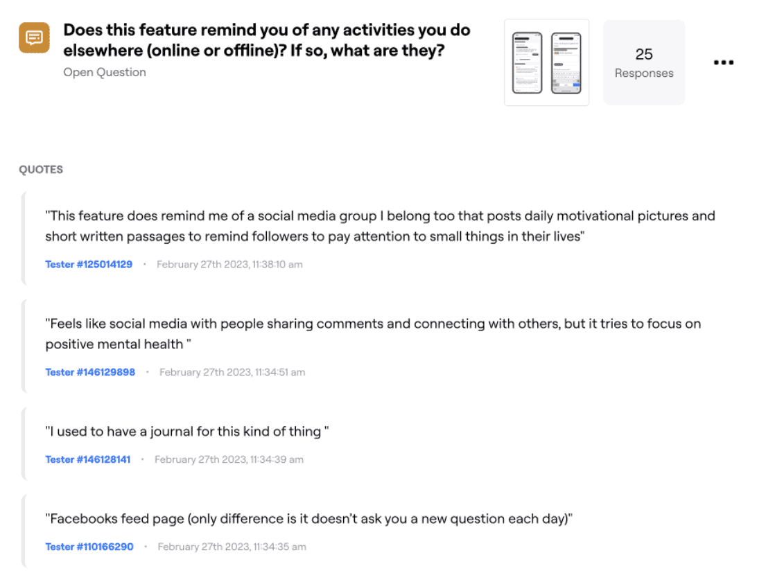
Question on mental models:
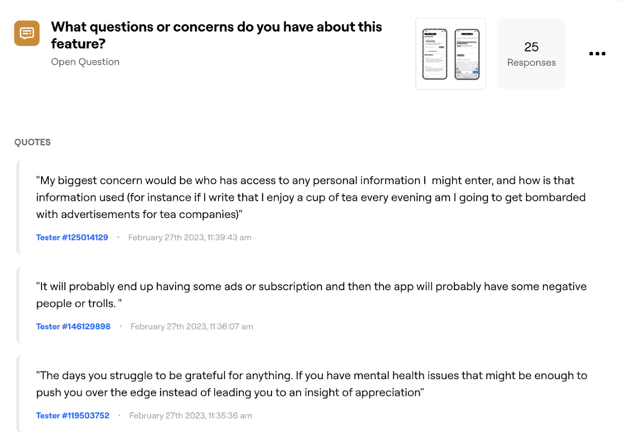
Questions or concerns:
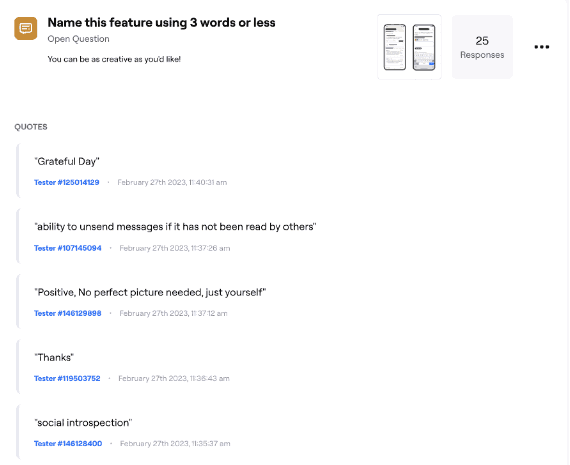
Name this feature:
Then, we showed users 3 different versions of the feature, The Writing Room, Social Journal, and Self Care Collective, and asked them to choose their preferred version and tell us why they chose that version.
The synthesis
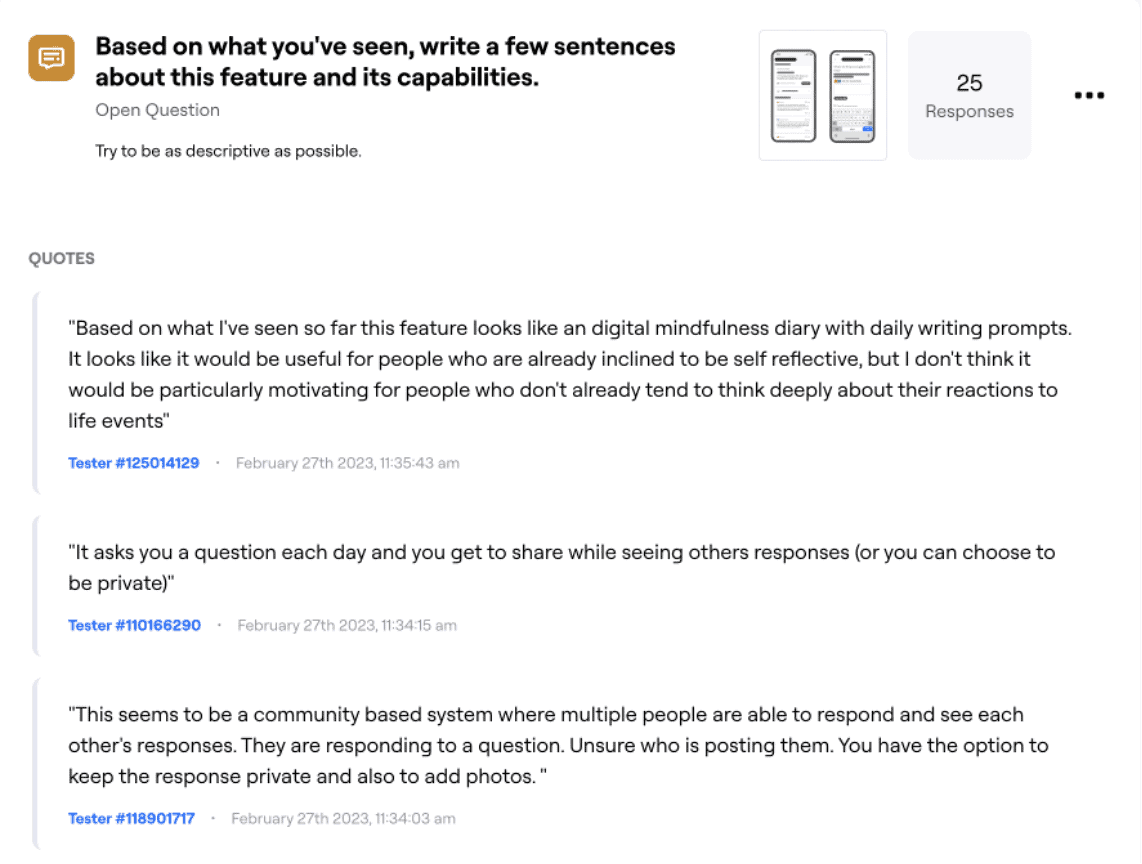
I synthesized results using Miro to organize any patterns and mental models that came through in the research. Here’s what we learned:
- People instinctively used words like “journal” “community” and “gratitude” to describe this feature
- Many were reminded of social media (Facebook, Twitter, Reddit) which suggests an understanding of the community aspect
- Gratitude journaling was the closest offline action
- Privacy was a big concern: people want to have control over which posts are shared
- Triggers were also a concern: people wondered how we might protect them not only from inappropriate or harmful posts, but also from more general triggers
- People preferred the Social Journal positioning because it:
- insinuated a community aspect
- felt like a familiar action
- was less intimidating than other options, and felt like a low barrier to entry
The discussion and final decision
I shared results with the team and we discussed them in the context of our name criteria that had been agreed upon earlier in the process.
After reviewing the results, we felt confident moving forward with the Social Journal feature positioning, since it mirrored most users’ mental models of the feature.
However, we tweaked the name from Social Journal to Community Journal after seeing so many responses using that term. We also felt that steering clear of the term “social” would help us differentiate this feature from a social network now that we were moving toward a physical journal concept.
Alas, the Community Journal was born. Landing on a solid name and position for this feature helped us move forward in the design and UX writing process and make decisions around where the feature would live within the broader app. Community Journal feature mockups. View full-size image.


Brand voice is just the beginning. Learn how to master tone and make your product truly adaptable.

Get hired: job hunting and portfolio advice for content designers
Join Patrick Stafford, Casey Webb, and Andrew Stein as they discuss content design jobs in 2026 and advice for landing…
 Jun 23, 2026

AI turned the lights on your content
When an agent can't act on your copy, it's not the AI or the writer. It's a decision nobody made,…
 Jun 15, 2026

9 essential AI concepts for content designers
You probably come across these terms all the time, but here's how these AI concepts can help you in your…
 Jun 12, 2026