

Interested in UX writing? Check out our complete guide to UX writing and content design.
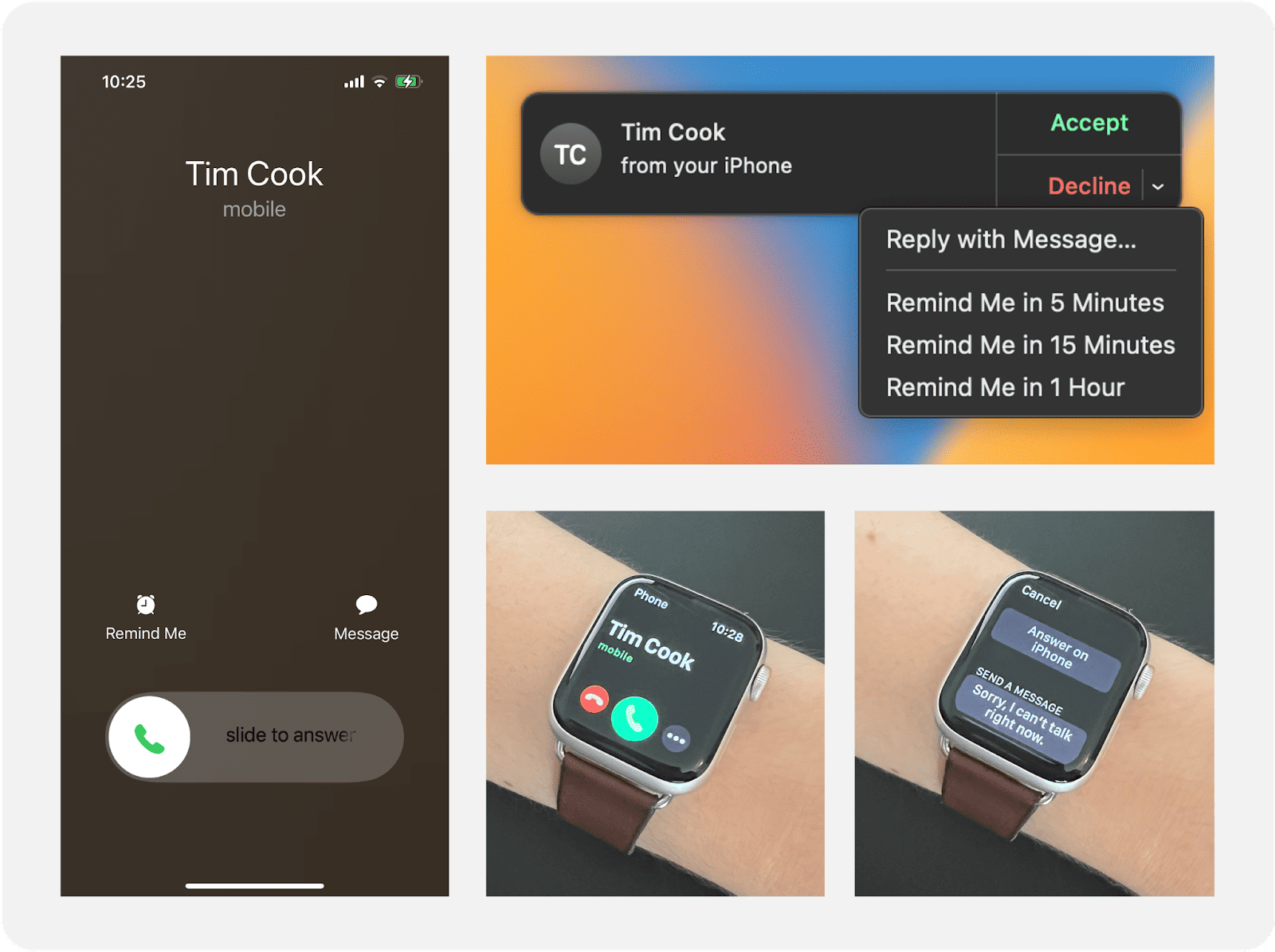
Imagine you’re working away on your laptop, with a phone on your desk, a wearable on your wrist, and Bluetooth headphones in your ears. You’re deep in thought as music plays quietly. And then you get a call.
That quiet, contemplative headspace suddenly gets replaced by ringtones, vibrations, and a sea of CTAs and suggestions on every screen. It’s disruptive, confusing, and irritating on a level you recognize only from getting requests like, “Can you just fix the copy?”
This is my experience every time someone calls me while I’m working. I’m all-in on the Apple ecosystem: MacBook Pro, iPhone, Apple Watch, and AirPods. Most of the time, it’s a smooth experience made better by connectivity. But when someone calls me, I’m so overwhelmed by where to look, what to read, and what to do that I usually decline the call just to make it stop. While the content may suit each individual UI, seen together it’s a mishmash of information and calls-to-action (pun intended).
For connected experiences with more than one screen, writing for distributed UIs ratchets up the complexity of creating a clear, cohesive, and helpful experience.
What are distributed UIs?
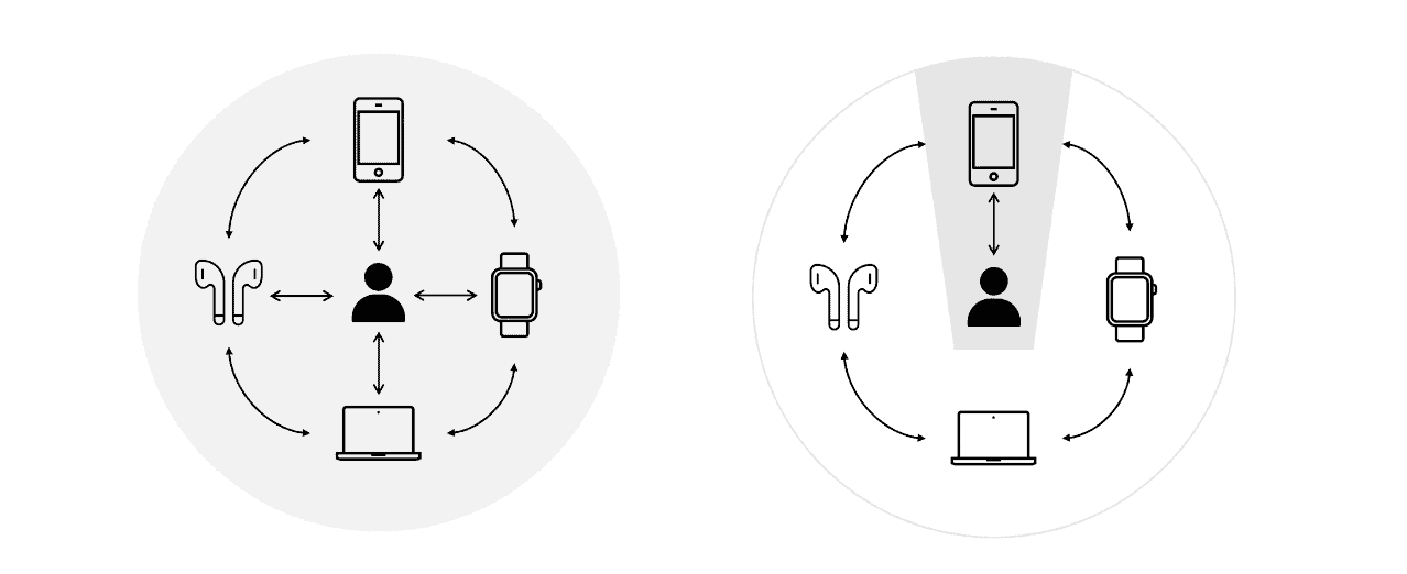
Distributed UIs are the multiple user interfaces within a connected ecosystem. You may see them in the same line of sight, but they appear on different devices: a phone, a wearable, a speaker, a car, a washing machine, and so on. How you interact with each UI can be the same or different: touch-based, voice-based, haptics, etc.
While each UI may offer its own experience, in concert with one another they have the potential to enhance or expand the product offering. In other words, the whole is greater than the sum of its parts.
For multi-screen ecosystems, content design gets complicated quickly. The UIs need to work together and apart. The UX may need to facilitate the same outcome in different ways. But with varying use cases and screen sizes, the UI becomes an even more critical consideration.
I’ve been lucky to work with distributed UIs in automotive and home appliances, previously at Volvo On Demand and now at Electrolux Group. Among the many challenges and fascinations, here are a few things I’m learning along the way.
Each UI needs a clear role
A good starting point is Michal Levin’s Designing for Multi-Device Experiences. He outlines three design approaches for these ecosystems: consistent design, continuous design, and complementary design. This framework provides a starter guide to consider how the UX adapts and expands across distributed UIs.
Levin underscores how the contextual interplay between user and device can change everything—after all, we want to place the right information, on the right UI, at the right time. “By mapping the variety of contexts across an experience, and then framing the roles each device plays in the overall ecosystem, we can create a clear narrative and mental model for that multi-device experience.”
A common mistake I’ve observed is to define the UX on one device and overlook how that content adapts (if at all) across UIs. As UX writers, we’re used to thinking about how copy scales with responsive design and translation. But distributed UIs are more than just responsive.
A user may relate to and interact with each interface differently, so knowing what role each device plays is essential. What is that device uniquely positioned to do? Given that, how do we define the breadth and depth of content for this UI? It’s worth considering use cases, screen size, ergonomics, and inter-device dynamics. Together, these parts ladder up to the holistic content strategy that reflects our user goals and business objectives.
At Electrolux Group, we design for an array of connected appliances: Ovens, cooktops, washing machines, robot vacuum cleaners, and more. On appliances, we write for screens ranging from 2.8” (7.1 cm) to 7.8” (19.8 cm) and have a smartphone app to complement. As cheesy as it sounds, I’ve started considering the role of each device based on its “minimum viable purpose.”
For example, someone buys a washing machine so they can have clean laundry. We can improve the experience and results with connectivity, but that is not a dependency for the washing machine to fulfill its primary purpose. The more content we try to pack into that screen—even if it seems to support the user’s needs and goals—the greater the risk of eroding that purpose and the non-negotiable value of that appliance.
While the appliance focuses on providing clean laundry, the app focuses on the experience of cleaning that laundry. The purpose for connectivity becomes the flexibility and personalization with which a user can achieve their goal despite the physical limitations of the washing machine. Both appliance and app play a distinct role, and therefore require a distinct content approach.
Identify the hero and their sidekick for each flow
Multi-screen experiences increase cognitive load: Where should I be looking? What will happen next on each UI? On which UI should I take action?
To mitigate this confusion, for every flow I like to designate one UI to be the hero and the other to be a sidekick. The hero holds the focus with dynamic content and CTAs. The sidekick refers back to the hero, sometimes explicitly saying, “pay attention over there,” to not distract or mislead the user. Together, they fight friction and smooth the way for an intuitive experience.
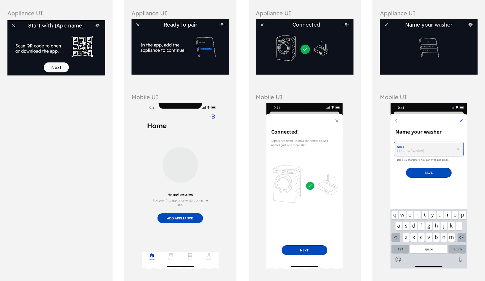
A common example for connected devices is provisioning, where a user connects the device and application to each other via Bluetooth and/or to their Wi-Fi network. For example, to provision an oven, a user goes back and forth between the appliance screen and their smartphone (and maybe their router).
In early user tests, we observed how confused users become when there’s continuous activity on multiple screens at one time. To address this, we specified which UI to focus on in the copy and simplified the sidekick flows so they remain static while new information and actions become available on the hero. That way, users aren’t constantly looking between screens. Even though the appliance and app aren’t connected yet, the content is still mirrored across devices. After various iterations, this added clarity was a highlight of the experience for some test participants.
It’s not an ecosystem for every user
Much of what I’ve shared focuses on writing for distributed UIs so that they complement each other, providing a complete connected experience for the user. But that’s the best case scenario. Just because someone buys a connected appliance doesn’t mean they’re going to connect it. And if they do, other people may live or work in that same household and use the product differently.
Some users may interact with every UI, while others focus on only one. Without a clearly defined role for each UI, it’s too easy to force the same experience and content across every device—effectively undermining the inherent value of a connected experience. But I’ve made that point already. Now, I’m interested in how content behaves on each UI to not leave any user out.
We can’t take product education for granted. Coming back to the oven UI, a connected user can see descriptions and recommendations for cooking functions on the appliance and in the app. If they dismiss the descriptions on the oven, they can always rediscover that information and more in-app. But for those who only interact with the oven UI, they may miss out on helpful guidance.
And then there’s saved programs and appliance-level settings. Who gets to edit these? How do their decisions affect the experience of other users? How will users know when something has been changed? These are questions we continue to grapple with at Electrolux and regularly test to understand the impact on our users. Ultimately, it shouldn’t matter if you’re all-in on the ecosystem or not. Connectivity is not a reason to compromise on usability.
Creating real value with connectivity
As distributed UIs continue to multiply in our homes, offices, cars, and virtual realities, writing for these connected ecosystems will only become more important. Critical consideration for content across multi-screen experiences can make all the difference between adding value and overwhelming. I’m one of the many consumers who still questions the universal value of connectivity. After all, my phone worked just fine on its own before every device in my home could receive calls.
But as I work with these offerings and continue to learn, I see how it helps our users when done right. We can help people save time, we can guide them to live more sustainably, and we can give them peace of mind about everyday things that matter a great deal—like safe food, fresh laundry, clean air and floors. With all this, we can enhance the value of our products and build love for our brands.
We just need to remember that connectivity alone is not a value-add. It’s about the role, it’s about the context, and it’s about the content.
Remy Ferber is the global design lead for UX Writing at Electrolux Group. Connect with her on LinkedIn!

A live, 4-hour workshop. Apply systems thinking principles to build content that scales across products.

Get hired: job hunting and portfolio advice for content designers
Join Patrick Stafford, Casey Webb, and Andrew Stein as they discuss content design jobs in 2026 and advice for landing…
 Jun 23, 2026
AI turned the lights on your content
When an agent can't act on your copy, it's not the AI or the writer. It's a decision nobody made,…
 Jun 15, 2026

9 essential AI concepts for content designers
You probably come across these terms all the time, but here's how these AI concepts can help you in your…
 Jun 12, 2026