

Interested in UX writing? Check out our complete guide to UX writing and content design.
If there’s one thing I’ve discovered working in a growing field like content design, I have a knack for stealing from one discipline and mixing it with another. (I come by this honestly, after convincing not one but two college advisors that I could use literary theory to analyze video games for my thesis instead of reading a bunch of books). And as someone who loved writing research papers in school, combining research methods with content was a great experiment for me.
There are many tools, terms, and best practices you can load up on before diving in (the UXCC has a great content research course to help you get started). One thing I was really drawn to from usability research was the concept of using heuristics and establishing UX writing principles.
If you’re unfamiliar with the term, there are some great resources out there (check out this guide from Bobbie Wood) for reviewing your content through a heuristic lens. But, taking a page from the research playbook, I’ve found it useful to do heuristic evaluations on product content.
What is a heuristic evaluation?
A heuristic evaluation tests the usability of a product by asking a panel of 3 to 5 experts to perform a task and note any concerns they have based on their areas of expertise.
If you’ve never done a heuristic evaluation before, the process is relatively simple. The researcher gives you a task (or sequence of tasks) to perform alongside a list of heuristics, which are a set of standards your product should ideally meet. This could be a commonly used list, like Nielsen’s 10 Usability Heuristics or Shneiderman’s 8 Golden Rules, or your researcher may have written their own list based on your specific product.
You’ll be in charge of performing the task and writing down any areas that don’t adhere to that list of rules. This could be helper text that doesn’t make sense, lack of documentation—really, anything you feel goes against that list of heuristics. Afterward, you’ll rank the severity of each issue to prioritize your solutions.
Content designers are great experts to include on an evaluation panel, but you can also use these UX writing principles in your own inventories or audits.
For a content heuristic evaluation, I like to evaluate each piece of copy on the page and determine whether or not it breaks one or more of those rules. Tooltips, modal headers, and even button text can have a remarkably wide range of heuristic issues.
Why evaluate UX writing principles with a set of heuristics?
Depending on your product’s issues, heuristics can be a great way to align your team on what to address first.
It helps you narrow down the issue. You know something’s off, but it can be hard to explain what. Assigning a heuristic to a problem makes you focus on where the problem really lies. Feel like your issue fits into more than one category? Maybe you’re dealing with more than one problem!
It gives quantitative data to an otherwise qualitative exercise. Metrics are crucial when it comes to advocating to improve an experience. Use these heuristics to analyze trends or even tally what percentage of your issues fall into each category to find areas your team should focus on.
It’s cross-disciplinary. Evaluating your content is great, but tracking these issues using the same list a UI or interaction designer does is even better. You have a unified metric by which you’re grading the entire interaction.
It creates a consistent experience for evaluators and, in turn, your users. Ensuring everyone uses the same set of heuristics keeps the analysis and recommendations consistent, creating a smoother user experience overall.
The usability heuristics applied to content
There are several standardized heuristic lists to choose from—Nielsen’s Ten Usability Heuristics, Shneiderman’s Eight Golden Rules, and Gerhardt-Powals’ principles are some of the most common—but here’s my content-focused way of using Nielsen’s Ten Usability Heuristics.
1. Visibility of system status
Your user should know what’s happening and never be left questioning an interaction. For content, this might mean a friendly toast notification when loading something takes longer than usual.

Questions to consider:
- Is there content in this interaction that lets the user know the status of their action?
- Do you alert users when a process is complete?
2. Match between system and the real world
Speaking your user’s language is perhaps one of the most important rules of content design. Use familiar terms in your products and remove any potentially isolating jargon.
Questions to consider
- Are there any unfamiliar words in this interaction, or words that have a different meaning than when commonly used?
- Do you utilize metaphors? Do they match the real-world/familiar meaning?
- Can these metaphors be localized for different languages and cultures if you work on a global product?
- Are you matching the user’s vocabulary?
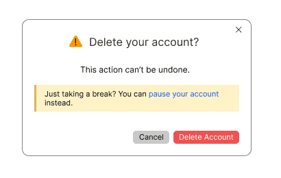
3. User control and freedom
We all make mistakes. Users should be able to back out or undo an action quickly and easily if needed. Clearly labeled Cancel buttons and explaining how to change an action in progress helps your users not feel trapped.
Questions to consider
- Does each modal or task sequence have a clearly marked exit?
- Does your content indicate that the action can’t be undone?
4. Consistency and standards
Perhaps my most frequently used heuristic when revamping old interaction patterns, this heuristic identifies issues where content doesn’t match an overall style (like your product’s style guide) or isn’t consistent within the interaction itself.
Questions to consider:
- Is the same action or concept labeled the same way across the interaction?
- Do your chosen words match the best-in-class or familiar language your users typically encounter?
- If your product has one, does the content match your style guide?
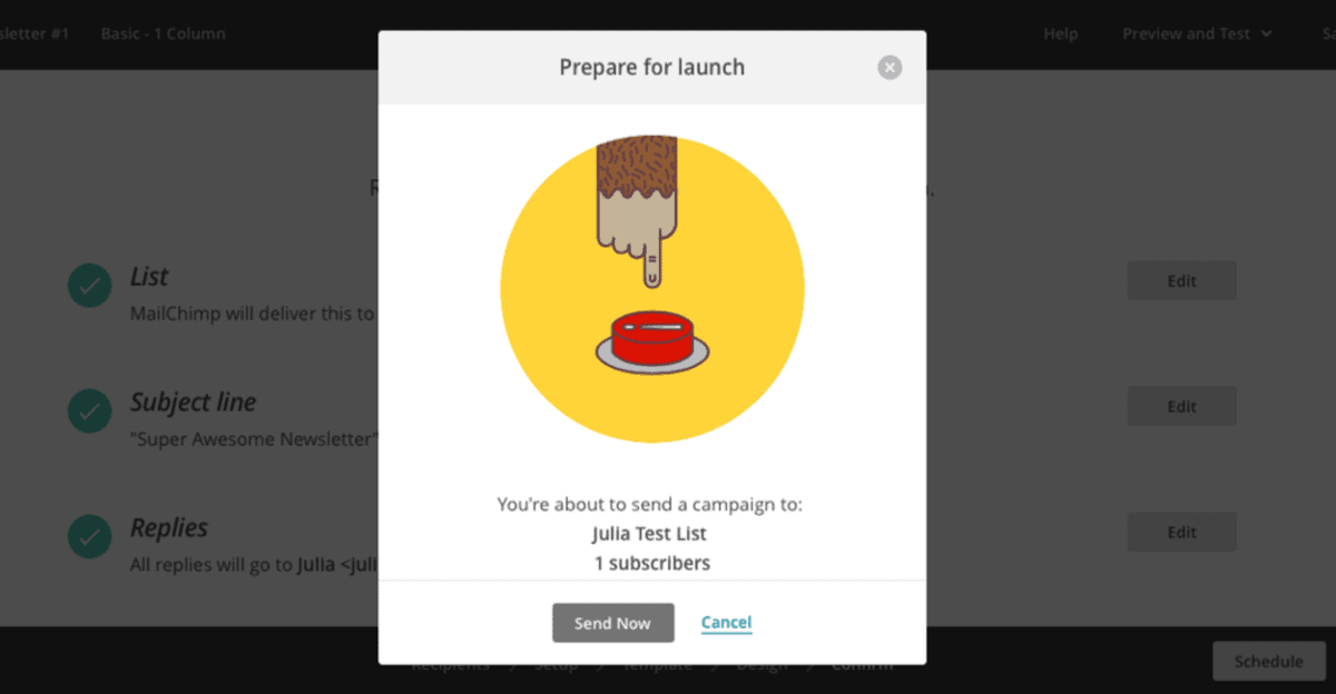
5. Error prevention
While we want to make sure users can recover from errors, the ideal course of action is to prevent errors in the first place. Tell users what an action does, especially a destructive one.
Questions to consider
- Do you provide adequate content for explaining destructive actions? Is it clearly placed in the interaction path?
- Is critical information repeated in relevant places, not just in one location?
6. Recognition rather than recall
Sometimes, users have to go through several steps to complete an action. Present information when a user needs it without forcing them to remember content from a previous step.
Questions to consider
- Are instructions broken into digestible pieces or presented all at once?
- Does the copy provide adequate help within the UI, or do users have to rely on external resources (like a support site)?
- Do users need to remember a lot of options from one step to the next?
7. Flexibility and efficiency of use
Your audience has differing comfort levels with using your product or technology. Give your users the option to approach your product in the way that best makes sense to them, not siloed into a single flow.

Questions to consider
- Are there any screens that a user can skip in this interaction? Does the content still make sense if you remove that screen?
- Is the experience personalized to specific users?
- Does your content make their experience more streamlined and enjoyable?
8. Aesthetic and minimalist design
The more things you try to cram on a page, the more complex the page becomes to use. Removing extraneous information helps the user focus on the task at hand, rather than being distracted by extra stuff.

Questions to consider
- Is your copy concise and scannable?
- Is there any irrelevant or rarely used content that could be offloaded into another view or moved to a lighter UI element?
- Does the important content stand out, like being placed in a more prominent spot?
9. Help users recognize, diagnose, and recover from errors
Accidents happen—servers break, and interactions fail. As content designers, we want to not only let users know something isn’t right but also help them fix it.

Questions to consider
- Are errors explained in plain language? (No error codes or jargon)
- Do you have instructions to help users resolve an error? If the error isn’t related to the user’s interaction, do you have a way to help them get an answer (like a support email or a status page link)?
- Are errors placed in the context of how to resolve them, like near a form field with missing information?
10. Help and documentation
This heuristic ensures your user has extra help or information when needed Helper text, in-app help widgets, and support documentation are typically the most common for this.

Questions to consider
- Is the documentation related to this interaction up to date (if this is an existing product) or planned/outlined (if this is a new product)?
- Is the help provided just in time, or do users have to leave your product and search for it manually?
- Is the documentation broken into discrete, scannable steps that are easy to replicate?
What’s next?
You know what’s wrong—so what do you do about it?
Like a severity ranking in a regular evaluation, I divide the listed issues into three categories: content issue, content + design issue, and overall usability issue.
- A content issue is something that I, as the content designer, can tackle, like updating a sentence that doesn’t match our style guide.
- A content + design issue is typically a UI issue I’d need to collaborate with my designer to solve, like moving critical text out of a tooltip and onto the main page.
- A usability issue stems from a content issue that needs to be addressed on a larger scale. Tackling this might take several members of the design team.
Now, it’s time to present your findings! Outline which heuristics appeared most frequently to highlight areas that need improvement. If you’re doing this alongside a content inventory or audit, you can create recommendations based on which heuristics appeared the most in your evaluation.
Don’t forget to reach out to your teams. Chat with designers, PMs, and researchers to strategize on addressing these issues. If you did the categorization step, you can prioritize your list based on who needs to be involved (i.e. you can get started on those content-only issues at any time.)
Go forth and heuristically evaluate!
Rachel Wood is a Senior Content Designer at Procore. Connect on LinkedIn!

Learn UX writing skills
Fundamentals of UX Writing
Learn real-world UX writing skills, get personal feedback and a UX writing certification, and build the craft and judgment needed to define, critique, and improve UI content.