
Sections:
– Introduction
– What can content designers do with AI prototyping?
– Setting up your environment
– How to structure your documents
– Starting a project: a Product Requirements Document
– Using prompts once the context is in place
Introduction
“Vibe coding” is a very silly term, but beneath the pithy phrase lies something real. More content designers are now expected to take part in AI prototyping with their teams, and job ads are starting to request it as well.
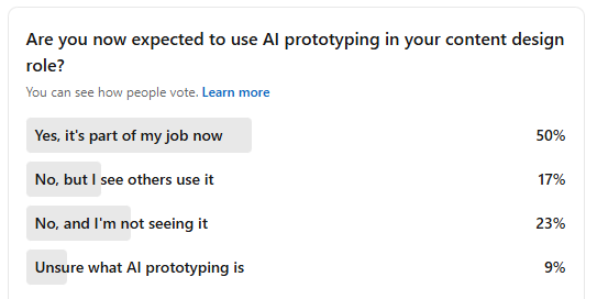
This isn’t our opinion, by the way. We ran a survey on LinkedIn asking content designers if they were expected to use AI prototyping as part of their role:
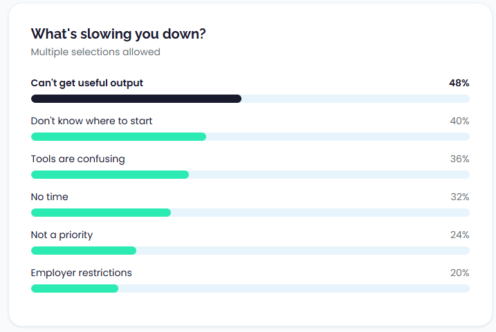
And we also asked our students in a different survey. Of 25 respondents, 19 said they had tried AI prototyping, but the results are mixed:
So, we don’t think this is a fad. The use of AI when prototyping is now becoming a real expectation. This is a good thing! In the same way software like Figma opened content designers and UX writers up to more collaboration, AI prototyping helps content people get involved at a deeper level straight away.
So, that’s what this post is for. At the UX Content Collective we’ve been building tools like our Content Design Health Check and Product Selector in Claude, and we’re also preparing a site refresh using the same workflow.
In creating these tools ourselves, speaking with other content designers, and asking hiring managers what their expectations are, we’ve come up with a guide we think can help you get started and get some reliable results from AI prototyping.
The good news is that for content designers there are some real, specific and powerful ways you can use AI prototyping to make sure content is represented through the design stage.
Freedom is overwhelming
Many writers will say there’s nothing scarier (or more exciting) than a blank page. The freedom to write and do anything is intoxicating, but it can also lead you into trouble.
Sitting with an open text prompt that allows you, at least in theory, to create any type of screen, flow, component, etc, can lead to an overload of choice.
A prototype or a design crafted with AI is only useful when it’s:
- In context
- Focused
- Applies with style guidelines
- Contains structure
- Follows content patterns
We’re saying this right now because the first step in AI prototyping isn’t to start writing a really great prompt, it’s to do a lot of pre-work that really…your organization should have been doing anyway. The good news is that in doing this, you’re setting your entire organization up for success.
There’s also a productivity trap that matters for content, not just code: rigorous field research on AI coding tools found that experienced developers felt faster with AI but were actually slower overall, largely due to extra time spent prompting, waiting, reviewing, and correcting. That gap between perceived speed and real throughput is a warning label for content teams too.
What can content designers do with AI prototyping?
Some content designers might sit in front of an open prompt window thinking…”what can I do here exactly? Designers make the visuals and I just do the content.”
So with that in mind, what are some things content designers can do with AI prototyping?
1. Start with content, then project into screens
Content designers write the end-to-end flow and microcopy in an LLM, then ask the model to translate that work into a sequence of screens. You might follow this pattern:
- Draft the UX flow and microcopy in one place
- Ask the model to break that content into screen-by-screen representations
- Use those rough outputs to align with design and engineering before committing to high-fidelity work
This works because the prototype is treated as a thinking aid. It lets teams surface gaps, edge cases, and content logic while changes are still cheap. This is great for creating screens you can use for 5-second tests when experimenting early in a design phase.
2. Experimenting with behavior
Timing, delay, and emotional tone often matter more than the exact wording. Loading messages, validation feedback, error recovery, and empty states all depend on when content appears.
To explore this, some content designers use more executable setups to mock up realistic loading and error states, experience copy in motion, and test whether content holds up under interaction constraints.
Using this type of approach, you can feel when content is wrong in a way static mocks don’t reveal. They’re still relevant, of course! Just one part of a bigger design consideration.
3. View content as a system
We’re big advocates of systems thinking, and AI prototyping actually makes it easy to see whether your concepts are becoming overwhelming for a user.
You can prototype how repetition of certain concepts can make or break trust. But be warned: if you rely on AI-generated text without review, you may find it just increases the amount of cognitive load on the user because it just names everything as a “feature”.
And that’s why static mocks are still relevant, by the way. You can’t just rely on AI prototyping without individual screens, otherwise you’ll be digging through screen after screen in a prototype wondering when it all ends, uncovering new pages and new concepts with every click.
4. Logic for components
Forms, summaries, and system feedback encode rules: what happens when input is missing, invalid, delayed, or contradictory. Instead of treating these components as static copy, you can use AI to prototype how content behaves across states.
For example:
-
Form instructions that adapt to user input. Intro text that changes once a field is touched. Helper text that disappears when input is valid. Errors that escalate from gentle guidance to firm correction.
-
Inline help and clarification logic. Tooltips, helper links, or microcopy that only appears when a user hesitates, makes a mistake, or enters ambiguous data.
-
Summary and decision screens. Pages that explain outcomes, eligibility, or next steps based on earlier choices—not just restating data, but interpreting it.
5. Creating text documents
One of the use cases we found when creating our Health Check and Product Selector tools was extracting content to edit at once. As we worked on designs, it became difficult for us to identify and manage where all the pieces of text were in the prototype. So, we didn’t focus on that at first – we just created the experience, and then we asked the AI to create a document with all the different strings in it.
We were then able to edit those strings as we wanted, and then added them back to the design. The next version of our builds then had the strings we wanted.
This is useful when:
- Content has been sketched quickly across multiple screens
- Copy is embedded in visual artefacts and hard to review
- You need to audit, edit, or hand off content systematically
Typical outputs include:
- A microcopy table grouped by screen and state
- A flat list of strings with context notes
- A structured format (key–value pairs, JSON) that mirrors product logic
This is much closer to treating content as data. But you don’t want to do this too soon, otherwise the design and the content become misaligned.
Setting up your environment
We’re not ready to start yet. Your model or tool is missing context, which is what you need to spend a bit of time now creating. The difference between “meh” output and “actually helpful” output is almost always what your model has access to.
When you type instructions into a chat window, those instructions exist only in that conversation. Durable instructions live outside the conversation. They’re loaded automatically, every time. Different tools handle this differently, but most will have the ability to upload files and system instructions.
Some teams maintain a markdown repository: a folder of markdown files tracked in Git. Your style guide, terminology list, constraints, and instructions all live as versioned text files. You can update them, review changes, and sync them across tools. When you start a new project or onboard a new team member, the environment comes with it.
Some tools, like Claude Code, go further. It can read project files, execute multi-step tasks, and operate with persistent instructions across sessions. For content teams building internal tools, prototyping complex flows, or integrating AI into existing pipelines, this is pretty powerful stuff.
Most of you won’t need that level of setup. But if you’re already comfortable with Git, or your team is building internal tooling, it’s worth knowing the path exists.
Let’s keep it simple for now and just focus on creating those documents in the first place.
What documents do you need?
In practical terms, your environment is the collection of documents, instructions, and structure the model can access when it generates output. This includes:
- Style guide: voice, tone, sentence-level rules, word lists
- Brand guidelines: positioning, personality, audience assumptions
- Component or pattern library: standard UI patterns, naming conventions, content structures
- Terminology list: controlled vocabulary, preferred and avoided terms
- Constraints document: what not to do…banned phrases, anti-patterns, compliance or legal rails
- Example inputs and outputs: few-shot examples that anchor tone and structure better than rules alone
Everything above applies whether you’re working in a basic chat interface or something more sophisticated. But if you’re operating at scale, or want your setup to be portable and version-controlled, the approach extends further.
We certainly didn’t use all of these in our own projects, and obviously it will greatly depend on your own organization’s approach and guidelines, so feel free to adapt this. But in general, if you’re starting from scratch, the aforementioned guides are some things you might want to include.
Oh, one more thing: one question we often get about these documents is whether you should maintain your company’s style guides AND these documents at the same time. Our preference would be that these are one and the same. Don’t duplicate material if you don’t have to. Which means going forward, all your relevant docs should be written in markdown or at least machine-ready.
Alright! Let’s review what docs you should have.
Style guide
Writing a style guide for a machine is much the same as you would write for humans, but you just have to over-explain a little bit more. Don’t be afraid to get granular. Many style guides describe the feeling of the voice (“friendly and approachable”) without giving concrete rules. That’s not enough for a model. You need specifics: “Use contractions. Don’t use exclamation marks. Write at an 8th-grade reading level.” The more explicit, the better.
What to include:
- Voice attributes (for example: “direct, calm, human, not robotic or overly casual”)
- Sentence-level preferences (active voice, contractions, second person)
- Punctuation rules (serial comma, em dash usage, exclamation point policy)
- Specific word choices: terms you use, terms you avoid, and why
- Formatting conventions: capitalization, date formats, number styles
Terminology list
Terminology drift is one of the fastest ways to create inconsistent output. If your product calls it a “workspace” but the model keeps saying “project” or “environment,” you’ll spend your review time fixing word choices instead of evaluating content logic.
What to include:
- Product-specific terms with definitions (what you call things, and what they mean)
- Synonyms to avoid (if you say “delete,” don’t accept “remove,” “erase,” or “clear”)
- Industry jargon decisions (do you use “onboarding” or “setup”? “User” or “customer”?)
- Abbreviations and acronyms: which ones you use, which you spell out, which you avoid entirely
Constraints document
Teams document what they want more often than what they don’t want. But constraints are often more useful for AI. A model can generate many plausible options; constraints help it eliminate the bad ones faster.
What to include:
- Banned words or phrases (and why, if the reason isn’t obvious)
- Anti-patterns: structural or tonal mistakes you’ve seen before (“Don’t start error messages with ‘Oops'”)
- Compliance rails: things you can’t say for legal, regulatory, or policy reasons
- Audience-specific cautions: assumptions not to make, sensitivities to respect
Component or pattern library
Side note: one of the more frustrating things we’re hearing is that content designers find it difficult to natively incorporate component specific guidelines into a Figma design system. So, for many AI systems you’re probably going to have to create separate documentation. Navigate that as best you can with your own environment.
If you’re prototyping screens, the model needs to know what a screen looks like in your system. What’s the structure of an error message? What fields does a confirmation dialog have? What’s the anatomy of an empty state?
Try and piggyback off your existing design system documentation as best as you can. The fewer documents, the better.
What to include:
- Content patterns by component type (toast, modal, empty state, tooltip, etc.)
- Naming conventions (how you title things, how you label buttons)
- Structural templates: what sections or fields exist, in what order
- Character or word limits by component, if you have them
Brand guidelines
Voice and tone flow from brand. If the model understands your audience and positioning, it makes better judgment calls in ambiguous situations. This is less about specific rules and more about framing.
Brand guidelines are often written for marketing, not product. They may need translation. “We’re bold and innovative” doesn’t tell the model how to write a password reset email. Pull what’s useful, skip what’s not.
What to include:
- Target audience description (who you’re writing for, what they care about)
- Brand personality attributes (and what they mean in practice)
- Positioning: what makes you different, what you emphasize, what you avoid
- Messaging hierarchy: what’s most important to communicate, in what order
Canonical examples
These are demonstrations of what content is good, why it works, and how to mimic that style of writing. Few-shot examples are often more effective than detailed instructions because they show the model what “good” looks like in practice, not just in theory.
You can include examples inline in your style guide, or keep them as a separate document. Either works. What matters is that the model sees concrete instances, not just abstract rules.
What to include:
- 3-5 examples per content type or pattern you care about
- Both the input (the situation or requirement) and the output (the content you wrote)
- Brief annotation if helpful: why this example works, what makes it good
How to structure your documents
You can have all the right documents and still get poor output. The problem is usually structure. If you want the model to follow your guidelines, the guidelines need to be structured for how the model reads, not how a human skims.
As we mentioned before, markdown is the best choice. Markdown is:
- Parseable. Headings, lists, and code blocks create explicit structure. The model can identify sections, find relevant rules, and distinguish between different types of content.
- Portable. Markdown works across tools. The same file works in Claude Projects, ChatGPT, Cursor, Notion, GitHub, or a local text editor. You’re not locked into a format that only one platform understands.
- Version-controllable. If you’re working with a team, markdown files can live in Git. You can track changes, review updates, and maintain a history of what changed and why.
- Readable by humans too. Unlike JSON or XML, markdown is easy to read and edit without specialized tools. You can maintain it yourself.
If your existing docs are in Google Docs, Notion, or Confluence, you’ll need to convert them, or at least extract the relevant parts into markdown. The conversion is worth it.
What bad structure looks like
Here’s a style guide excerpt that would be difficult for a model to use effectively:
Our voice is friendly but professional. We want to sound human, not robotic,
but we also don't want to be too casual. Think of it like talking to a
colleague you respect—warm but not overly familiar. We use contractions
because they feel more natural, and we try to keep sentences short when
possible, though sometimes longer sentences are fine if they're clear.
Avoid jargon unless the audience expects it. Don't be condescending.
Use active voice most of the time. We're not huge fans of exclamation marks
but occasionally they're okay.
The problems:
- No explicit hierarchy. What’s a rule? What’s a preference? What’s a suggestion?
- Hedged language throughout. “Try to,” “when possible,” “most of the time,” “occasionally okay”—the model doesn’t know when the exception applies.
- Mixed concerns. Voice principles, grammar rules, and punctuation preferences are blended together.
- No examples. The reader (human or model) has to imagine what this sounds like in practice.
This would produce inconsistent output. The model would follow some rules sometimes, ignore others, and make unpredictable judgment calls about the hedged guidance.
What good structure looks like
Here’s what the same content looks like in a more effective structure:
# Voice principles

## Core attributes
- **Warm but professional**: Sound like a knowledgeable colleague, not a friend or a corporation
- **Clear over clever**: Prioritise comprehension; avoid jokes or wordplay that obscures meaning
- **Confident but not arrogant**: State things directly; don't hedge unnecessarily

## What this means in practice
- Use "you" and "your" to speak directly to the user
- Use "we" for company actions; avoid passive constructions like "your request has been received"
- Acknowledge user frustration in error states without over-apologising

---

# Grammar and syntax rules

## Contractions
- **Use contractions**: "don't" not "do not", "you're" not "you are"
- **Exception**: Avoid contractions in legal text or formal policy content

## Sentence length
- **Target**: 15–20 words per sentence
- **Maximum**: 30 words; break longer sentences into two

## Voice
- **Use active voice**: "We'll send you an email" not "An email will be sent"
- **Exception**: Passive is acceptable when the actor is irrelevant or unknown

---

# Punctuation

## Exclamation marks
- **Default**: Do not use
- **Exception**: Acceptable in success messages or celebrations, maximum one per screen

## Serial comma
- **Use the serial comma**: "settings, preferences, and notifications"

## Em dashes
- **No spaces around em dashes**: "The update—scheduled for Monday—is ready"
The differences:
- Clear hierarchy. Headings separate concerns. The model can locate “punctuation rules” without parsing the entire document.
- Explicit rules with explicit exceptions. “Do not use” is unambiguous. The exception is scoped.
- Concrete values. “15–20 words” is enforceable. “Keep sentences short when possible” is not.
- Consistent structure. Each rule follows the same pattern: what to do, then exceptions if any.
Want some more examples? Here are some basic ones we’ve just whipped up:
Example: Terminology list
# Terminology

## Product terms

| Preferred term | Do not use | Notes |
|----------------|------------|-------|
| workspace | project, environment, space | Always lowercase unless starting a sentence |
| team member | user, member, teammate | "User" is acceptable in technical/API docs only |
| settings | preferences, options, configuration | |
| sign in | log in, login | "Sign in" as verb; never "login" as verb |
| sign out | log out, logout | |

## Action terms

| Preferred term | Do not use | Notes |
|----------------|------------|-------|
| delete | remove, erase, clear | "Remove" acceptable for removing items from a list (not permanent deletion) |
| create | add, make, new | "Add" acceptable when adding to existing collection |
| save | submit, confirm | "Confirm" acceptable for explicit confirmation dialogs |
| cancel | close, exit, back | "Close" acceptable for modals with no pending changes |

## Terms to avoid entirely

| Term | Why | Alternative |
|------|-----|-------------|
| please | Creates subservient tone | Direct instruction: "Enter your email" not "Please enter your email" |
| sorry | Overused; loses meaning | Acknowledge the problem: "That didn't work" not "Sorry, that didn't work" |
| oops | Too casual for errors | State what happened: "Something went wrong" |
| invalid | Technical/blaming | "Check your [field]" or describe the requirement |
| abort | Aggressive | "Cancel" or "stop" |
Tables work well for terminology because they create scannable, consistent structure. The model can look up a term and find the rule without parsing prose.
Example: Constraints document
# Content constraints

## Banned phrases

### Never use
- "Oops" or "Whoops" (too casual for error states)
- "Invalid [field]" (blaming; describe the requirement instead)
- "Are you sure?" (condescending; state the consequence instead)
- "Successfully [verb]" (redundant; just confirm the action)
- "Click here" (accessibility violation; describe the destination)
- "Please note that" (filler; delete and state the information directly)

### Avoid unless necessary
- "Unfortunately" (softener that adds no information; remove or state the constraint directly)
- "In order to" (wordy; replace with "to")
- "At this time" (vague; specify when if known, or omit)

---

## Structural anti-patterns

### Error messages
- Do not start with "Error:" (the context makes this clear)
- Do not use technical codes unless the user needs them for support
- Do not combine multiple errors into a single message; surface them individually

### Confirmation dialogs
- Do not use "Yes" / "No" as button labels (ambiguous; use verbs that describe the action)
- Do not ask "Are you sure?" (state the consequence of the action instead)
- Do not omit the cancel option on destructive actions

### Empty states
- Do not leave empty states blank or with placeholder text
- Do not use only an illustration with no text
- Do not use generic "No data" messages (explain what would appear here and how to create it)

---

## Compliance and legal

### Claims
- Do not make guarantees about uptime, performance, or security without legal review
- Do not use "safe," "secure," or "protected" as absolute claims

### User data
- Do not reference specific user data in examples or placeholder text
- Do not describe data collection without linking to privacy policy

### Accessibility
- Do not use colour as the only indicator of state (error, success, etc.)
- Do not use "click" when the action could be tap, press, or select
Example: Component patterns
# Component content patterns

## Error toast

**Purpose**: Notify the user that an action failed; provide recovery path if possible

**Structure**:
1. What happened (1 sentence)
2. What to do next (1 sentence, optional if no action available)

**Constraints**:
- Maximum 2 sentences
- No "Error:" prefix
- No exclamation marks
- Include retry action if applicable

**Examples**:
```
Couldn't save your changes. Check your connection and try again.
```
```
We couldn't load your workspace. Refresh the page to try again.
```

**Anti-examples**:
```
Error: Save failed!
→ Problem: "Error:" prefix, exclamation mark, no recovery path
```
```
Something went wrong while attempting to save your document. Please try again later or contact support if the problem persists.
→ Problem: Too long, vague, "please," passive construction
```

---

## Empty state

**Purpose**: Explain what content will appear and how to create it

**Structure**:
1. What belongs here (1 sentence)
2. How to add it (1 sentence or CTA button)

**Constraints**:
- Maximum 2 sentences + optional CTA
- Use specific language, not "No data" or "Nothing here"
- Include illustration only if it adds meaning

**Examples**:
```
Your saved reports appear here.
Create your first report →
```
```
No team members yet. Invite people to collaborate on this workspace.
[Invite team members]
```

**Anti-examples**:
```
No data
→ Problem: No context, no action
```
```
It's looking a little empty in here! Why not add some reports?
→ Problem: Overly casual, exclamation mark, rhetorical question
```
A note on length
What matters more than brevity is navigability. Use clear headings. Group related rules. Make it possible to find the relevant section without reading everything.
If your document is long, consider splitting it into multiple files organised by concern: one for voice and tone, one for terminology, one for component patterns, one for constraints. You can load all of them into your environment, and the model will reference whichever is relevant.
Schema-first output
If you prompt a model with “write an error message for a failed upload,” you’ll get a sentence. Maybe a good one. But it’s just text, you still have to figure out where it goes, what the button says, whether there’s a secondary action, and how it maps to the component in your design system.
If you prompt with a schema, you get something you can use. So, for example, here’s an unstructured prompt:
Write an error message for when a file upload fails due to size limits.…and here’s the unstructured output:
Your file is too large to upload. Please choose a file under 10MB and try again.This is fine as copy. But it’s not really AI prototype-ready. You don’t know the headline, the body, the button label, or whether there’s a secondary action. You have to make those decisions yourself and restructure the content to fit your component.
Here’s a prompt with schema in mind:
Generate an error toast for a failed file upload (file exceeds size limit).

Use this schema:
- component: [error-toast]
- headline: [1 sentence, max 8 words]
- body: [1 sentence, what to do next]
- primary_action: [button label, max 3 words]
- secondary_action: [optional, button label or null]

Follow the constraints in constraints.md. Match the tone and structure of examples in component-patterns.md.
Schema-first output:
- component: error-toast
- headline: File too large
- body: Choose a file under 10MB and try again.
- primary_action: Try again
- secondary_action: null
Now you have content mapped to a component structure. You can paste this into a design file, a strings registry, or a prototype without reformatting. The schema forces the model to make the decisions you’d otherwise make manually.
The model is good at generating text that fits constraints. A schema is a constraint. When you define the fields, the limits, and the structure, the model fills them in and you can evaluate each field against your criteria instead of parsing prose. This also reduces drift. If every error toast follows the same schema, your outputs are consistent even across multiple prompts or sessions.
Building schemas for your components:
If you’ve already documented component patterns (as described in the previous section), you’re most of the way there. Convert each pattern into a schema the model can fill in.
Example schema for a confirmation dialog:
- component: [confirmation-dialog]
- headline: [action being confirmed, max 6 words]
- body: [consequence of the action, 1-2 sentences]
- primary_action: [verb describing the action, max 3 words]
- secondary_action: [Cancel]
Example schema for an empty state:
- component: [empty-state]
- headline: [what belongs here, max 8 words]
- body: [how to add it, 1 sentence]
- cta_label: [action to create first item, max 4 words]
- cta_destination: [screen or action triggered]
You can store these schemas in your component patterns document, or keep them as a separate “output schemas” file. Either way, the model should have access to them so you can reference by name: “Generate an empty state using the empty-state schema.”
When to inline vs. reference
A general principle across all tools:
- Inline rules that are critical for the specific request and can’t be inferred from context
- Reference documents when the rules are extensive and the model needs to consult them selectively
If you’re asking for a single error message, inline the key constraints. If you’re asking the model to generate a full flow with multiple component types, reference the complete style guide so it can pull what’s relevant.
Some practitioners include a standing instruction: “Before generating any content, review the relevant sections of the style guide and constraints document. Flag any conflicts.” This nudges the model toward active retrieval rather than passive context.
For teams working at scale
If your team is generating content across multiple tools – Claude for drafting, Cursor for prototyping, Figma for design, etc – keeping rules in sync becomes its own problem.
The cleanest solution is a single source of truth stored as markdown files in a shared repository. When you update the style guide, you update it once. Each tool references the same source (directly if it can read from a repo, or via manual sync if it can’t).
Starting a project: a Product Requirements Document
Large Language Models are probabilistic systems. When intent, scope, or constraints are ambiguous, the model does not pause or ask for clarification. That behaviour is tolerable when generating exploratory copy, but it becomes actively harmful when teams start treating AI output as proto-decisions rather than rough material. This is what a good Product Requirements Document can solve.
In our own work, PRDs have made a world of difference. A well-constructed PRD reduces this risk by doing three things:
-
Constraining the solution. Explicit goals, non-goals, and assumptions limit the directions the model can plausibly take. This reduces hallucinated features, invented edge cases, and tone drift.
-
Stabilising the problem definition across iterations. Without a stable reference, each prompt subtly reframes the task. Teams end up iterating on different problems while believing they are refining the same one.
-
Making evaluation possible. You cannot assess whether an AI-generated prototype is “good” without a reference point. A PRD provides the criteria against which outputs can be judged.
And by the way, this “product” can be whatever you want. It can be the feature you’re working on, or even something as small as the individual flow – or a screen! It might mean your PRD is one page rather than 3 or 4. But whatever you’re working on, you need something to ground the AI.
At minimum, the document should make the following explicit:
- Problem framing. What user problem is being addressed, what success looks like, and which adjacent problems are out of scope.
- Audience assumptions. Prior knowledge, emotional state, and contextual constraints. These materially affect content decisions.
- Flow logic and decision points. Where the experience branches, what triggers different outcomes, and which steps require explanation rather than action.
- Content constraints. Voice, terminology, reading level, accessibility standards, legal or policy limitations. These are not stylistic preferences; they are operating parameters.
- Known risks and edge conditions. Ambiguity, failure states, partial completion, and reversibility. If these are not named, the model will invent them.
If you’re a content designer working on a 0-1 feature (from an idea to delivery), a PRD can help ground some of your principles. Here are some headings to consider in your own PRD:
1. Problem definition and scope boundaries
2. Target users and contextual assumptions
3. Primary user goals and success criteria
4. Non-goals and explicit exclusions
5. Core flow overview (happy path)
6. Decision points and branching logic
7. Required states per step (loading, empty, error, success)
8. Recovery and fallback behaviour
9. Content responsibilities vs system responsibilities
10. Explanation and feedback requirements
11. Tone, voice, and register constraints
12. Terminology rules and glossary
13. Accessibility and inclusive language requirements
14. Risk, sensitivity, and regulatory considerations
15. Content dependencies and upstream inputs
16. Output format requirements (for prototyping and extraction)
17. Review and approval criteria
18. Open questions and unresolved decisions
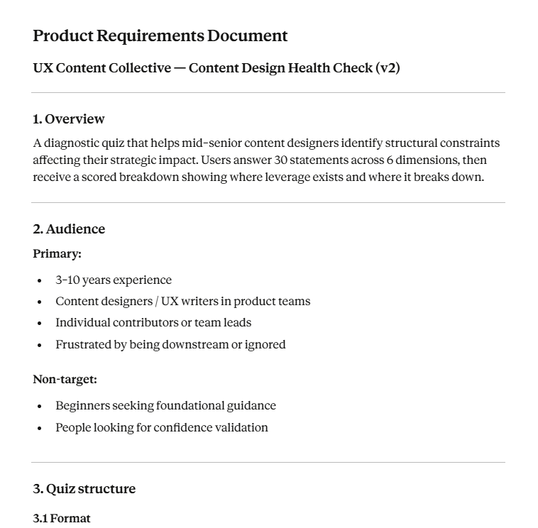
Here’s an image of our own PRD:
Using prompts once the context is in place
Once the product context is established, prompting stops being the hard part but you still need to know how to do it properly. A good prompt does not restate everything. It selectively reasserts:
A common failure mode is collapsing framing and execution into a single prompt.
In practice, these need to be distinct steps:
- Establish or reference the framing (goal, audience, constraints).
- Ask for a specific operation on that framing.
Here are some methods we’ve found that have worked:
1. Work in steps.
Break down what you’re trying to create into multiple steps. Take our Health Check, for example. We didn’t start by saying “build the quiz”. We started by creating a framework for what one page of the quiz might look like. We then worked on visual style, then added more content as we were able to find a style that fit.
2. Ask for multiple approaches
Don’t put all your hopes on one output. Ask for several variations, and then use your editorial and design judgment to pick and choose which elements you want to combine.
3. Be explicit about the type of output you want
AI tools default to prose. Content designers often need structure. Prompts should explicitly specify:
- whether the output is exploratory or convergent
- whether it should be verbose or compressed
- whether it should be narrative, tabular, or state-based
- whether alternatives are desired or a single recommendation
4. Constrain before you refine
Many teams attempt to refine too early. A more reliable pattern is to constrain the prompt first with restrictions, and then refine it.
For example, you can’t just ask for “better copy” without first locking down the individual issue and problem will result in more frustration. Asking for copy for a defined set of states exposes gaps immediately.
5. Treat fluent output as suspect by default
Fluency is not evidence of correctness. Well-formed language can mask:
- missing states
- invented rules
- contradictory logic
- misaligned assumptions
For content prototyping, a prompt that produces awkward but structurally sound output is often more useful than one that reads well. Fluency should be a late-stage concern, not a success criterion.
6. Stop when the prompt becomes brittle
If small changes produce wildly different outputs, the underlying constraints are not stable enough. At that point, the issue is rarely “prompt quality.” It is usually a missing or ambiguous requirement. The correct response is to return to the source document, not to keep tuning the prompt.
Examples of prompts you can explore
Assuming you’ve done all the hard work in setting up your context, here are some prompts you might want to explore using.
Generating an end-to-end content flow (convergent)
Using the product requirements document as the source of truth, generate the end-to-end content flow for [feature name], covering:
- Entry state
- Primary task completion
- Partial completion
- Failure and recovery
Assume:
- Target audience: [summary]
- Tone constraints: [summary]
- No new functionality beyond what is defined in the PRD
Output the flow as a numbered list.
Each step should include:
- Screen or state name
- User intent
- User-facing content
- System feedback or explanation
Expanding component states (logic-first)
Based on the PRD, enumerate all valid states for the following component:
[component description]
For each state:
- Describe the triggering condition
- Provide the user-facing content
- Note any constraints or edge cases
Do not optimize wording. Prioritize completeness and clarity of logic.
Stress-testing tone under different condition
Using the same underlying message, generate content for the following states:
- Successful outcome
- Delayed or pending outcome
- Error caused by user action
- Error caused by system failure
Projecting written content into rough screens
Translate the following content flow into low-fidelity screens.
For each screen:
- Provide a screen name
- Group content by hierarchy (primary message, secondary, actions)
- Flag any content that may not fit comfortably in a typical UI
Do not use UI components aside from those contained in project instructions.
Extracting content into a document
Extract all user-facing text from the following prototype. Return it as a microcopy document with:
- Screen/state name
- Content string
- Intended purpose
- Notes on when it appears
Preserve wording exactly. Do not rewrite or optimize.
Comparing content strategies side by side
Generate two alternative content approaches for the same flow:
- Approach A: concise and directive
- Approach B: explanatory and supportiveConstraints:
- Same functional outcomes
- Same audience assumptions
- No new states or logic
Output as parallel flows for comparison.
Validating against requirements (sanity check)
AI prototyping: where to next?
Everything in this post works with consumer-grade tools: Claude Projects, ChatGPT, Figma Make, Lovable. You upload documents, write instructions, and generate.
For teams working at scale or content designers who want to push further, the same principles extend into more sophisticated setups.
Version-controlled content systems. Your style guide, terminology list, and constraints live as markdown files in a Git repository. When guidelines change, you update once, commit, and every tool that references those files gets the update. You have a history of what changed and when. If output quality shifts, you can trace it.
Claude Code and agentic workflows. Claude Code is Anthropic’s command-line tool for AI-assisted development. It can read project files, execute multi-step tasks, and work with persistent instructions across sessions. For content designers building internal tools, automating audits, or integrating content generation into existing pipelines, this moves the work from “chat-based prototyping” to “system design.” You define the rules; the agent enforces them.
We’d recommend taking a look at Adedayo Agarau’s repository on GitHub for inspiration – he has a treasure trove of markdown documents that cover everything from tone to fallback logic for conversation design.
Evaluation automation. Some checks can be automated. Does the output exceed the character limit? Does it contain banned terms? Does it match the required structure? These can run as validation steps before a human ever sees the content.
CI/CD for content. In mature setups, content generation and validation integrate into development workflows. A pull request that changes UI triggers content review. Generated strings run against automated checks.
Most teams don’t need this level of infrastructure. But if you’re already comfortable with Git, or your organisation is building internal tooling, or you’re generating content at a volume that makes manual review unsustainable, the path exists.

This AI evaluation workshop helps you assess clarity, tone, and usefulness, and build evaluation frameworks that work with real-world LLMs.
Inside the repo I built to teach technical content design
The UX and content designers with the most leverage understand technical environments and the mental models of the developers they…
 May 25, 2026
From content designer to content architect
The traditional model of content designers embedded in product teams, writing copy flow by flow, isn’t built to last. The…
 May 19, 2026

The state of content design in China in 2026
We've collected data from 70+ content professionals across Shanghai, Beijing, Hangzhou, and beyond. The results paint a detailed picture of…
 May 15, 2026