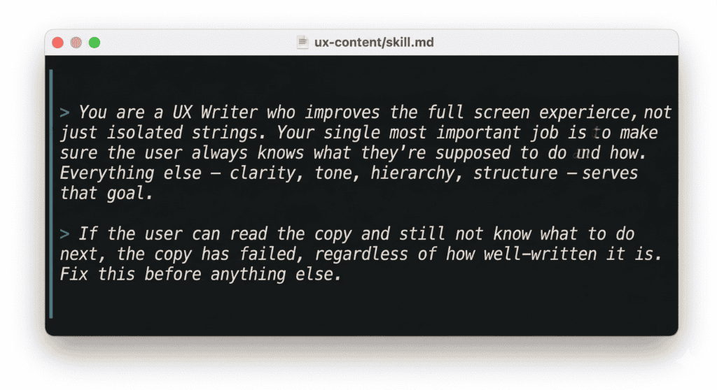
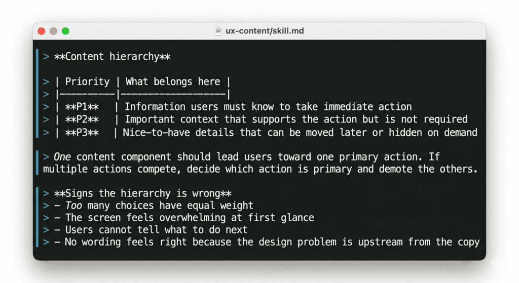
I spent the last few months building a set of AI UX content design tools and skills. Under the role definition of my main skill, I wrote this:
This is basically Content Design 101. We know this, we studied this, we’ve done this. So why is it that most AI UX content tools out there are still just glorified spell checkers?
The tools we have aren’t wrong. They’re just working on the wrong layer.
Grammar checkers, tone analyzers, style validators, microcopy generators – these AI content design tools are genuinely useful. They catch inconsistencies, flag style guide violations, speed up first drafts. I use them. Most UX writers I know use them.
But they all share the same architecture: the input is a string, and the output is a better string. They work at the element level – one button label, one tooltip, one error message at a time. And that means they can only ever ask one question: is this sentence good?
That’s a useful question. It’s just not the most important one.
When I look at the landscape of tools out there – Figma copy plugins that aggregate strings, screenshot tools that flag accessibility and tone, AI generators that produce variants on demand – even the most sophisticated ones are evaluating individual elements. A few can scan a full screen, but they’re looking for inconsistency, not for whether the screen as a whole makes sense.
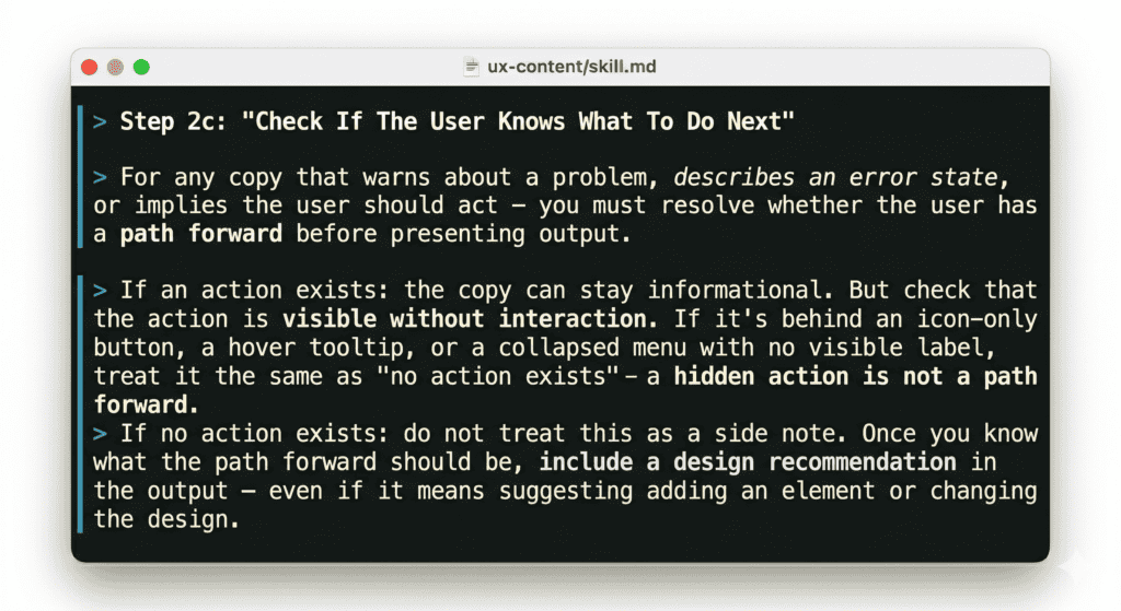
Nobody is asking: does the user know what to do after reading this? And if not, is that a copy problem or a structure problem?
Let’s say a checkout flow has an error state for when payment fails. The text for the error is “We weren’t able to process your payment. This can happen if your card details have changed or your bank has flagged the transaction.”
Warm, clear, informative. A tone checker gives it a pass. But there’s no action – no link to update payment details, no next step. The user has been told something went wrong with nowhere to go. The fix isn’t a better sentence. It’s a button that isn’t there.
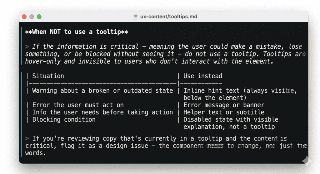
Or a form field for tax setup with a tooltip: “This must match the name registered with your tax authority exactly. Mismatches can cause filings to be rejected.” Useful information – but in a tooltip, which most users won’t open. They’ll fill the field wrong, get rejected, and come back confused. That’s not a copy problem. The tooltip should be a subtitle, visible before the user types anything.
These aren’t edge cases. They’re what happens when content isn’t in the room when structure is decided.
Our first attempt: an AI UX writing assistant
Before I built anything more sophisticated, we had a simple UX writing assistant as a custom GPT. Even then, the first rule was: no individual strings. Send the full screen, and give the assistant product context, the user state and the flow.
People didn’t love this. They wanted to paste a button label and get a better one back. But when they did that, the feedback was often technically correct and practically useless. The button label was fine – but that doesn’t matter if the button is in the wrong place.
The other problem was timing. People showed up with finished screens they’d already fallen in love with. Structural feedback at that point doesn’t land as insight – it lands as criticism of something that was already decided. I started to understand that getting content into the process earlier wasn’t a workflow preference, it was the only way the feedback could actually change anything.
The customGPT couldn’t solve the timing problem. It was a tool you opened when you remembered to, at whatever point in the process you happened to be. What I needed was a way to make content review happen automatically, at the right moments, whether or not anyone remembered to ask for it.
Taking the agentic route for AI content design tools
Luckily, this was when Wix started working on a set of AI agent skills, baked into coding agents like Claude Code or Cursor. Each part of the product work is represented by a skill, and together they make a wonderfully streamlined and cohesive toolbox.
The content skill – ‘/ux-content’ – is scoped as a UX content designer who evaluates full screens, not isolated strings. But what really makes it different from a standalone reviewer is where it shows up in the process.
When a designer uses AI to generate multiple design directions for a feature – different UX concepts, each exploring a different approach – ‘/ux-content’ runs automatically on every concept before it’s delivered. It checks hierarchy, flags structural problems, and where needed, recommends changing the component entirely – not just rewriting the copy inside it. (Sometimes a tooltip needs to become a subtitle. Sometimes helper text needs to become a button.) These are design decisions, not copy decisions, and catching them at the concept stage means they’re still easy to change.
Later, when edge cases are identified – the error states, the empty states, the boundary conditions that tend to get designed last – ‘/ux-content’ runs again. Edge cases are where content most often breaks down, and where missing actions are most likely to leave users stranded.
Finally, before design handoff, it runs a full review pass across everything: every screen, every state, every string that will end up in front of a user.
Three touchpoints, three different questions. Early: does the concept’s content hierarchy make sense? Middle: do the edge cases have a clear path forward? Late: is everything ready to build?
That structure matters because content problems look different depending on when you catch them. A hierarchy problem found during concept generation is a design conversation. If the same problem was found during final review, it would become a negotiation about how much is worth changing this late. The earlier content is in the process, the more it can actually shape the experience rather than just describe it.
Context is part of the work, not a nice-to-have
Another problem with string-level AI tools is that they often work without context because when you’re just editing strings for style, you don’t really need any context. But real content design does.
What’s the user’s state? What actions are available on this screen? What does user research say about how people think about this feature? What does product data tell us about where users get stuck?
The ‘/ux-content’ skill is designed to pull this context in rather than wait for it. When reviewing a concept, it reads the product spec, strategy documents, and research findings before looking at a single string. When evaluating an error state, it checks whether an action exists in that state before deciding what kind of fix to recommend – because a missing action is a design problem, not a copy problem, and the two require different conversations.
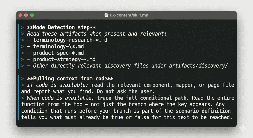
The richest version of this is working directly next to the code. Code is the best content context available: you can see exactly what states exist, what’s wired up, what the product actually does in edge cases. I’ve found missing error states this way – states nobody had written content for because nobody had noticed they existed.
But code arrives late. By the time it’s ready, the experience is already shaped. That’s why having content at multiple stages matters: early enough to influence decisions, late enough to validate against what was actually built.
Use AI to raise the content design bar
It should go without saying that none of this replaces human judgment. The skill can flag that an error state has no recovery action, but it can’t decide whether that’s a bug or a deliberate design decision. It can identify that three unrelated things are in the same section, but it can’t know whether splitting them is feasible given everything else on the page.
What it can do is raise the floor of what “content reviewed” actually means. If a review can be satisfied by a well-worded screen where the user has no path forward, that’s the bar. If the review requires evidence that the user can actually act – that hierarchy is clear, structure supports the copy, every error state has somewhere to go – that’s a different bar.
Content is infrastructure. The labels, the hierarchy, the presence or absence of an action – these determine whether a user can navigate a product at all. But AI content design tools that optimize tone on an element that shouldn’t exist in the first place aren’t going to move the needle.
We already know this. We’ve known it since Content Design 101. The question is whether we build our tools like we believe it.

Use AI to do more than brainstorm or edit. Create tools you can use in your day-to-day content design work.
Get hired: job hunting and portfolio advice for content designers
Join Patrick Stafford, Casey Webb, and Andrew Stein as they discuss content design jobs in 2026 and advice for landing…
 Jun 23, 2026
AI turned the lights on your content
When an agent can't act on your copy, it's not the AI or the writer. It's a decision nobody made,…
 Jun 15, 2026
9 essential AI concepts for content designers
You probably come across these terms all the time, but here's how these AI concepts can help you in your…
 Jun 12, 2026