The idea of atomic design has only been around since 2016 and I find that kind’ve hard to believe because it feels like every major project I’ve worked on—for the last decade at least—has used atomic design principles, to one degree or another.
Sometimes it was just to impress clients and win new business. Sometimes it was more as a reference tool, to keep product teams on the right path. But sometimes it was a methodology followed much more closely, right from the start. And it’s those projects that stand out for me: when atomic design was laid down early as the blueprint and we all built outwards from there.
Those projects were the most satisfying. And the most successful.
Brad Frost, a US web designer, came up with atomic design and wrote the book on it. It’s one of those theories everyone seems to agree with. But everyone has their own thoughts on how to apply it.
I’ve lost count of the times I’ve been in a room, surrounded by rainbows of Post-its, while people debate what defines an atom, a molecule, an organism. The idea gets sliced and diced in lots of different ways.
But whether you follow it to the letter or not, the important thing is atomic design gives you a framework that makes the design process better for everyone. And that’s particularly true for UX writers.
It might feel, at times, like atomic principles are putting design first, or focusing more on the containers your content must fill up. That’s something we writers naturally bristle against. It’s a grievance as old as time, or at least as old as the internet, so I won’t bring it up again here.
But what atomic design does really well is pretty much the opposite. It brings writing closer to design on the most fundamental levels. It forces designers to think about every element in their design system and how to scale them across a whole experience.
This means the question of language arrives earlier and when that happens, the writers get to influence more of the design decisions up front. (AKA the moment when your eyes gently close and your forehead emits light because you’ve reached Verbal Nirvana).
If you’re not entirely sure about atomic design or you’ve seen different versions of it, here’s a simple recap of how it works.
Atomic design at a glance
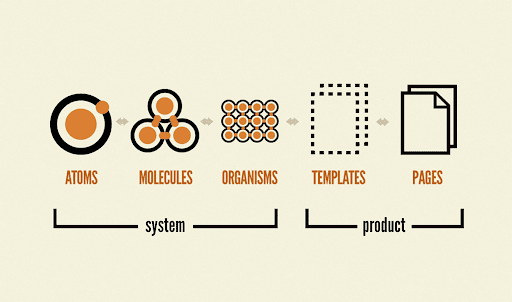 Atomic design breaks down into five clear stages. I find the first three are most useful for UX writers.
The official definition from Brad Frost goes like this: “Atomic design is a methodology composed of five distinct stages working together to create interface design systems in a more deliberate and hierarchical manner.”
In other words, it’s thinking about design in terms of building blocks. Specifically, chemical building blocks like atoms and molecules. You use these blocks to move through five stages of creation.
Atoms
Atoms are single UI elements that can’t be broken down any further without losing their meaning. For example: a form label, a text field, a button.
Molecules
Molecules are collections of atoms that make a new unit. For example: a form label (“Search”) + a text field (“Find your product”) + a button (“Go”) = a search module.
Organisms
Organisms are groups of molecules that make bigger sections of an interface. For example: a nav menu containing a search module, a store finder and a language picker.
Templates
Templates are multiple organisms placed in a layout. At this stage, your design is taking shape and you’re probably looking at a wireframe for a whole screen or user state.
Pages
Pages are templates brought to life with UI design. It’s when the visual experience comes into its own and puts everything else to the test (right back down to the atoms).
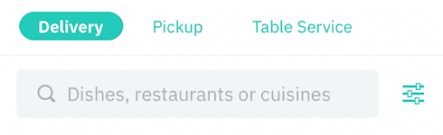 The search bar in the Deliveroo app is a molecule. It’s made up of atoms (x3 categories, x1 text field, x1 search filter)
Writing with atoms
For UX writers, I think it’s helpful to zero in on the first three stages: the atoms, molecules, and organisms. Everything is made from these three ingredients. Thinking of them like that—as three interchangeable building blocks—can help you frame how you’ll write for an app, product, or service.
Here’s an example. I was once part of a team designing a new app for a co-working space. People would come to the workspace, download the app, and use it to book meeting rooms, order lunch, create passes for guests (and so on). The design system was built on atomic principles. Once you designed a component it got reused again and again. In all contexts, it had to stay consistent.
Not just in look and behavior, but in the way it spoke, too.
So I started writing components in a more elemental way. If the designers were working with an atomic system, how could I mirror that with my copy? Cards, for instance. Some of the most common cards in our app followed a simple three-part formula:
Header + Subheader + Body Copy
And you could break each of these parts down into smaller units of meaning:
Header = 1 idea (an atom)
Subheader = 2 ideas (a molecule)
Body Copy = 3+ ideas (an organism)
Here’s how it worked in practice, on a card introducing users to meeting rooms:
[Header = 1 idea]
Rooms[Subheader = 2 ideas]
Book a room and invite people to join you[Body Copy = 3+ ideas]
Huddle rooms, war rooms, board rooms. Choose the kind of space you need then set the time and date for your meeting.
As a mental model based on atoms, it might look something like this:
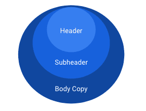 Headers, subheaders, body copy. They function as a unit but they can also function by themselves.
I applied this to more and more components as they were created. And it got easier and easier to jam with the UX and UI designers in my team. They got what I was doing, I got what they were doing. We had a common currency.
Remember the inverted pyramid?
If you’ve ever been a journalist you’ll know about “the inverted pyramid”. It’s another mental model used by writers, but in this case, it’s a tool for writing the news. It helps you prioritize information so readers absorb it fast. The trick is to write a headline and first paragraph that give essential facts only. The rest of the article then adds detail, should people choose to read it. Either way, they come away informed.
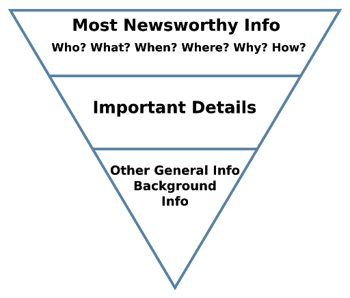 This method has been used since the 19th century. In the 21st century it still works just as well.
This isn’t far removed from atomic thinking. Note how the pyramid has three levels. How it leads with singular ideas, then adds more ideas as it flows downwards. For a long time, it’s been a proven way to put the reader first. So much so that most people reading the news will never realize this device is guiding their behavior.
The best kind of UX writing does the same thing. When it’s crafted well and truly human-centered, your words almost become invisible. People just intuitively get it and know what to do next.
When you and your designers work in a shared atomic system, it gets easier to map your outputs against each other. “What’s this H1 going to do? And this H2? OK, so for one idea your character limit could be x. For two ideas it could be y.” It reduces the guesswork now and later on down the road. And most importantly—it brings the writer and designer together, so they can think it all through at the same time.
The building blocks of language
One reason atomic design appeals to me is because it’s a logical act of building. People who don’t like to write sometimes say it’s because they’re not creative. Or they’re just not “right-brained”.
I’ve always found writing more of a left-brain activity. 95% of the time, I’m not painting with wide, inspired strokes. I’m trying to capture that inspiration and narrow it down in a way that makes the most sense and that’s when logic and structure come into play.
Writing is like building with LEGO. Your headings set up your sentences, your sentences set up your paragraphs, your paragraphs set up your story. They’re units and they’re all designed to support each other. If you pull out even one block, the bigger object you’re building changes shape. So you go back and reorder more blocks. Which usually helps you build better.
This is the essence of atomic design. Building piece by piece. Seeing what doesn’t work, then rebuilding to make everything stronger. It’s a way of moving between the parts and the whole that makes sense to everyone: designers and writers alike.
One system, two results?
You can tell when brands are making the most of atomic design. Whether their writers have formalized it in their verbal guidelines or not, if they’ve been brought into the atomic approach—it starts to shape how they communicate.
Check out Starling Bank. Everything is modular, you can see the elements that are built to be reused. And the copy is written to suit. Single ideas in headers and buttons. Combined ideas in body copy and product descriptions. It might seem obvious to write this way. But it’s surprising how inconsistent the writing in some products can be. Sometimes a short header, sometimes a long header. Brief descriptions here, long descriptions there.
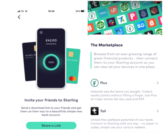 Starling Bank makes it feel like copy and design are following the same system.
Take a look at the Amazon Alexa app for some contrast. The design is atomic but the copy is doing its own thing. Why is “Alexa” namechecked for kids and parents but not for the voice shoppers? Why do kids and parents get a conversational description—but voice shoppers get a short, robotic one? Why are both features enabled by two different CTAs? Why is one all-caps, the other not?
It might seem pedantic to go into this level of detail, but when you’ve “gone atomic,” I think you have to. Small deviations like this, repeated over time, make it harder for users to recognize patterns and less likely to use an interface. This feels like a classic case of a writer being left outside the design process.
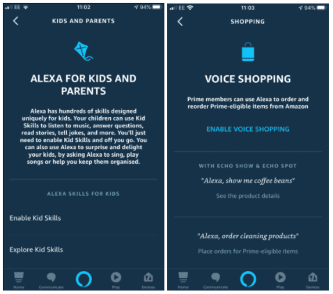 Amazon Alexa app feels like atomic design but the copy is coming from a different place.
The Modulor Scale
All of this reminds me of the modernist architect Le Corbusier, who devised something truly unique in the 1940s. He was looking for a way to bring two separate measuring systems—imperial and metric—closer together. And he ended up turning the human body into a unit of measure. By breaking the human form down into parts, he defined a whole new way to design the proportions of buildings.
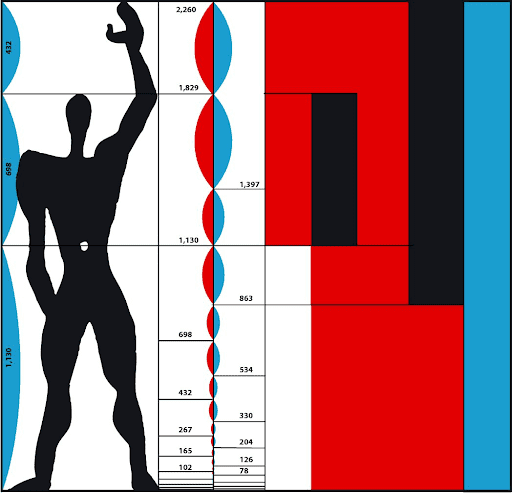 “The Modulor” by Le Corbusier: an architectural scale based on the human body.
Ultimately his idea never caught on. However, in spirit, it shares a lot in common with atomic design. It tries to bridge two ways of working (in our case, designing vs. writing). It breaks the design process down into a kit of reusable parts (like atoms and molecules). And it literally brings human beings, the people we’re designing for, back to the center of things (the whole point of atomic design).
We need more moments like this when we stop and look at our current systems and try to find ways to move them forward. I think atomic design was one of those moments. But historically they always seem to come from the designers.
We need to hear more from the UX writers. We need more techniques and models that define this role and give it more tools to make an impact.
This discipline is still young and there’s lots of room left for insights that set new standards and put our skillset on the map.
Atomic design needs atomic writers.
But maybe atomic writers will be the ones who split the atom. 🤯
Russell Norris is Founder and Copy Director of The Konfig located in London, UK. Connect on LinkedIn.

A live, 4-hour workshop. Apply systems thinking principles to build content that scales across products.

We’ve rebuilt our Fundamentals of UX Writing course
The expectations for content designers and UX writers have changed. We're upgrading our curriculum to keep up.
 Jul 27, 2026
Get hired: job hunting and portfolio advice for content designers
Join Patrick Stafford, Casey Webb, and Andrew Stein as they discuss content design jobs in 2026 and advice for landing…
Jun 23, 2026
AI turned the lights on your content
When an agent can't act on your copy, it's not the AI or the writer. It's a decision nobody made,…
 Jun 15, 2026