The Daily UX Writing Challenge, then and now

Want posts like this in your inbox?
Join the 12,000+ content designers who receive our newsletters.
When I first heard about UX writing, I wanted to try my hand and see if I would be any good at it or if I liked the work. So, in early 2020, I joined the Daily UX Writing Challenge. This challenge meant I would:
- Get a scenario every day for 15 days
- Have to write the solution in 10 minutes
- Share my work on the dedicated Facebook group to get feedback
When I finished, I shared all my challenges in a single post, including the tools I used and my process. I got great feedback from the community, which gave me the confidence to believe that I could go through with this career change at some point.
Fast forward to November 2022. I was one week away from getting my UX Writing/Content Design certification and was hard at work on my portfolio. When deciding what to include in it, I remembered that I went through this challenge.
I thought it would be fun to do an experiment and redo some of my work from back then. After all, incremental improvements, revisions, and iterations are a part of the process. This meant that I could also apply what I learned during the Academy. I was curious to see:
- How my perception/understanding has changed
- How different the new iterations would be
- How I feel about revisiting my work
In 2020:
- I made my mockups in Photoshop/Squarespace using app screenshots or images I found online
- I had little knowledge of design principles, psychology, best practices, etc.
In 2022:
- I can confidently use Figma for my designs
- I have a wealth of knowledge, better arguments to support my decisions, and the ability to properly document my thought process.
I chose only 5 samples for this experiment so let’s see how it went:
Day 5: App stopped working
Scenario
The user works in graphic design. While critiquing a design in a mobile app, their phone abruptly turns off. When they restart the phone, they reopen the app.
Challenge
Write a message that the user will read immediately upon opening the app. What do they need to know? What steps (if any) do they need to take to recover their content? What if they can’t recover the content?
Constraints
Headline: 40 characters max
Body: 140 characters max
Button(s): 20 characters max
2020
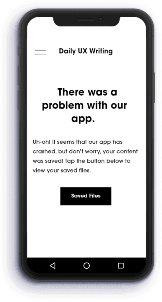
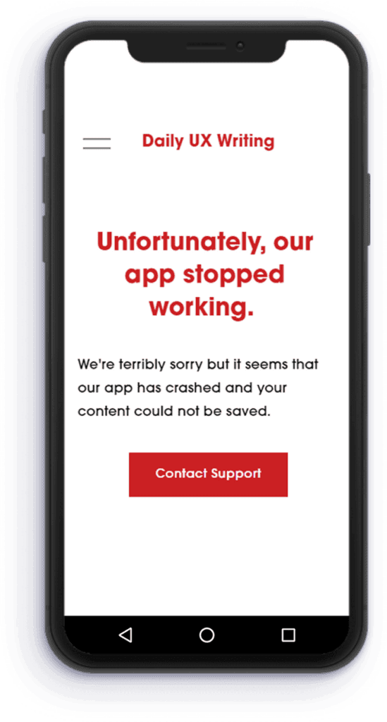
Back then I made two variations to account for the case in which the user is able and unable to recover their content.
Comments
- Titles usually don’t contain end punctuation.
- The use of Uh-oh! is frowned upon.
Comments
- Content is a vague word and does not fit well in this context.
- The Contact Support CTA is a bit out of context and rather useless. The user was informed that the work wasn’t saved, at the same time, it is unlikely that the support team can help.
2022
Copy
Possible user emotions: Relieved, delighted, thankful
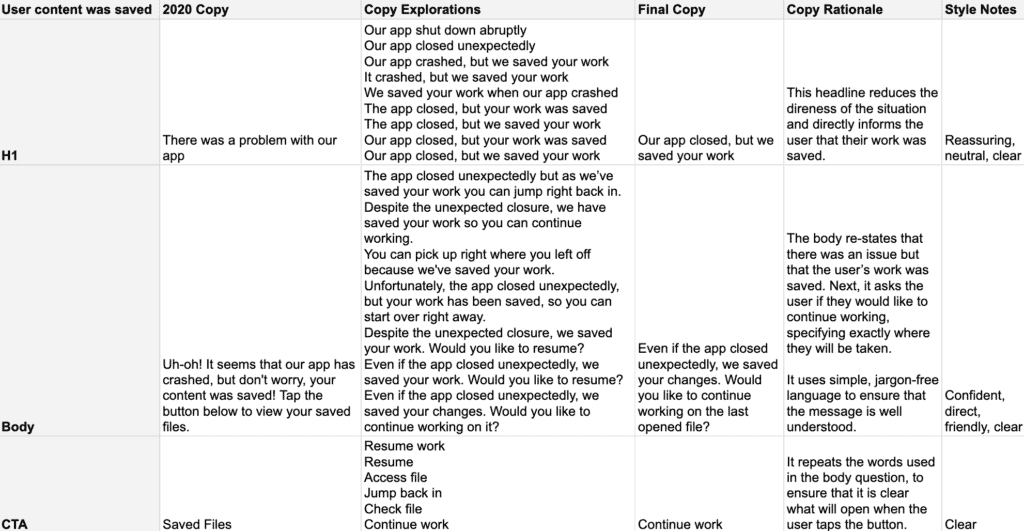
Mockup
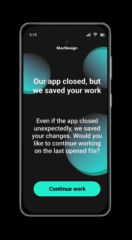
Mockup

Day 6: Fire on route
Scenario
It’s Monday. A user has just gotten into their car to drive to work. They plug their phone into the car and start driving.
Challenge
How would you let the user know there’s a fire happening in a nearby town that is causing road closures? The effect on their commute is unknown, but there is a definite danger if the fire gets closer. How do you communicate this to them? When? Write it.
Constraints
Headline: 30 characters max
Body: 45 characters max
2020
Explorations
- Hazard reported on your route
- Hazard reported on route
- Danger on route
- Fire on route! Please take a different road/route.
- We recommend you change your route.
- Fire reported, take an alternate route.
- Fire reported on your route, please change it
Comments
- It is a bit bleak and doesn’t use the information we have available in the challenge
- The user is most likely driving, this message doesn’t give any solution to the problem it presents without a CTA. Ideally, this CTA will show the user’s possible options with relevant information such as estimated times of arrival.
- The pop-up choice is still valid. The user would likely have the navigation app open while driving.
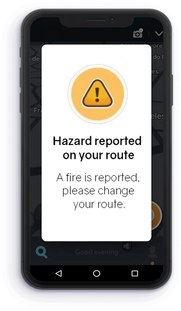
2022
Copy
Possible user emotions:Anxious, focused on driving, fearful
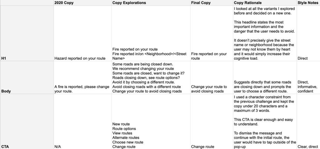
Mockup
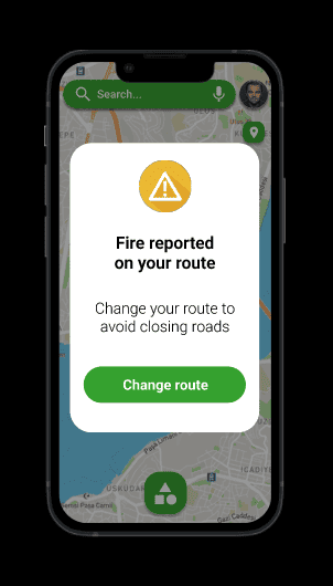
Day 8: Concert tickets
Scenario
The user is a casual music fan and (on occasion) goes to live concerts. They have a music player app on their phone.
Challenge
Tell the user that one of their favorite bands is playing live in their town. How would you compel them to want to go?
Constraints
Headline: 30 characters max
Body: 45 characters max
Button: 25 characters
2020
Explorations
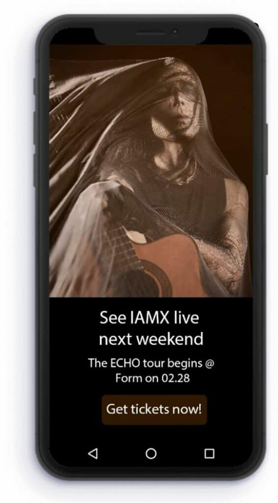
- See IAMX live next weekend
- IAMX has never been closer
- IAMX in concert near you
- IAMX album tour starts with you
- The ECHO tour begins @ Form on 02.07
- Get ready for the ECHO experience
- Get tickets now!
Comments
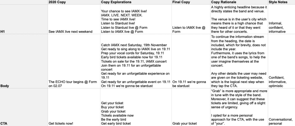
- The scenario does not specify that the music app is open. In this case, the best form of delivery would be a push notification. The constraints also support this decision.
- If the app is open, the message would ideally be delivered as a pop-up while the user is listening to music.
- I still really like this band so I used them again.
- We’ll also keep the venue and date format. The venue is one of the most well-known in Cluj-Napoca for concerts.
- The date format is wrong, in our region we usually write it as dd/mm/yyyy.
2022
Copy
Possible user emotions: Excited, surprised, interested
Mockup
I made a push notification and a pop up variant.
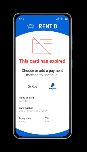
Day 9: Expired card
Scenario
The user is trying to rent a car using an application but the credit card on file has expired.
Challenge
Write them an error message so that they can correct the problem.
Constraints
Headline: 30 characters
Body: 45 characters
2020
Explorations
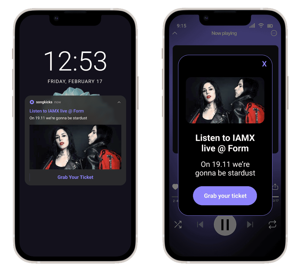
- It seems this card has expired
- Enter new card information to continue.
- To continue, please enter the new credit card
- Continue by entering the new card information
- Continue by adding a new payment method
Comments
- “It seems” is not particularly helpful language.
- There is no CTA in the constraints but we’ll assume that once the user fills in the new card details they will be taken to the payment processing page or the confirmation page.
- The user may be in a rush to rent this car so asking them to add a new card may not be good enough.
2022
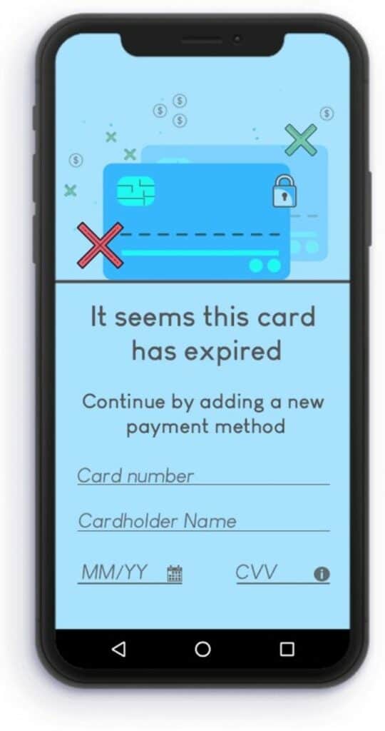
Copy
Possible user emotions: Anxious, tense, ashamed
Mockup
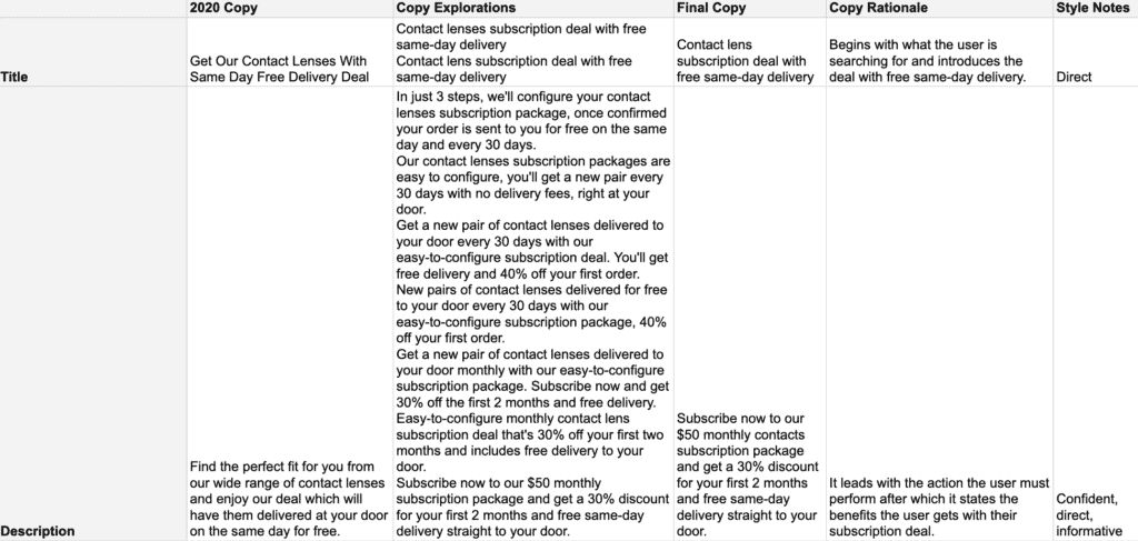
Day 11: Meta title and description
Scenario
An elderly user is doing a Google search to find an easy way to buy contact lenses online.
Challenge
Write a title and meta description for a website that sells subscription contact lenses delivered to a user every 30 days—convince them to try it.
Constraints
Title: 60 characters max
Meta Description: 160 characters max
2020

Comments
- We’ll keep the URL
- There is no mention that this is a subscription service or that the user will get lenses sent to them every 30 days.
- Should be clear and easy to read.
2022
Copy
Possible user emotions: Hesitant, confused, impatient
Mockup

Takeaways
- I found that I had kept all the working files from 2020 which helped me relive the experience and emotions. Surprisingly enough I forgot that I had made copy explorations.
- I loved going over my work and improving what I had already created. Fresh eyes and my new knowledge helped me create better and clearer versions.
- To ensure I didn’t get too distracted, I worked on the copy first and then on the designs.
- I got a chance to go over the feedback I got back then and incorporate it. For example, one member suggested that I brand my mockups which I tried to do where appropriate.
- It took me about 10 hours to redo these challenges.
Alexandra (Spark) Onofrei is a UX writer/content designer with over a decade of experience creating, managing, and strategizing content. Connect on LinkedIn!
Learn real-world UX writing skills, get personal feedback and a UX writing certification, and build the craft and judgment needed to define, critique, and improve UI content.

Alexandra Onofrei
More from the UXCC blog

How I built an AI tool that does real content design
At Wix, we've been building a set of AI agent skills for product and UX content design work, baked into…
 Ayelet Kessel
Apr 28, 2026
The 8 technical content design skills you should learn
The job of a content designer is to guide users through an experience using the right information at the right…
 Patrick Stafford
Apr 17, 2026
Content design isn’t about words, and never was
For 20 years, content designers have been arguing for visibility. And for twenty years, the answer has mostly been polite…
 Michelle Savage
Apr 6, 2026


