

Interested in content testing? Check out our complete guide to content testing and measurement.
“No one will notice the change in the wording. It’s too subtle.”
“It’s not worth testing the copy. People don’t read.”
“Users just push buttons. Let’s not worry about optimizing the copy.”
I have heard several versions of these statements throughout my career as a UX content designer. While they’re often said with bravado, these claims are 100% false. And I have the numbers to back it up.
Seemingly tiny tweaks to UX copy can actually lead to big improvements in the user experience and performance. But don’t take my word for it. Here’s a glimpse into the science-backed reasoning for why small changes matter in UX copy and examples of experiments that I’ve led.
Why ‘small’ changes matter a lot, especially in UX copy
UX copy tends to be short and sparse given the limited space on our mobile screens. It’s sometimes referred to as microcontent or microcopy. These words act as helpful signage that orients you and signals where you’re heading. UX copy also helps you understand how the product functions. And if done well, it can make completing tasks feel simple and seamless.
Now consider how the typical reader absorbs digital copy. Nearly 80% of people scan content instead of reading it word-for-word, based on a well-known study. People tend to read this way because they may feel time constrained and scanning probably feels like the most efficient way to take in information.
Time-tested research from that same group also shows that people used different methods to scan copy such as the F-pattern and layer-cake pattern. These two patterns showed that readers focus heavily on things like:
- The first few words of each line of text,
- Titles, headings, and subheadings, and
- Buttons with calls to action, or CTA
That’s one of the many reasons A/B testing copy in these areas makes a lot of sense. Improve the areas where eyes are typically fixating on and in places where key decisions are made, such as CTA buttons.
Case study: CTA-only test boosts clickthrough rate
Before I go into the first case study, let’s quickly review what is an A/B test.
It’s an experiment where you compare the performance of what currently exists (control) to the changed experience (treatment.)
Usually, half of your target audience sees one version and the other half sees the other, and the experience is randomized. (Here’s a great article on the fundamentals of A/B testing and the benefits of doing it, in case you want to dig in deeper.)
Now back to the case study. The CTA button is one of the smallest UI elements used to convey information on websites and mobile. But don’t let its size deceive you. Changing your CTA copy can lead to a massive impact on your conversions and getting people to move down your UX flow.
I recently ran an A/B test where changing only the CTA led to a 1% increase in the click-through rate. For context, this is a big jump considering this copy was shown to millions of people.
Here’s a made-up example that resembles the test that I helped run. In this example, we’re showing our audience a discount offer for men’s clothing. Half of our traffic saw Option A and the rest saw Option B.
Which one do you think performed better?

If you guessed Option B, you’re right. The hypothesis is Option B performed better because the CTA button reads more action-oriented and it’s tapping on consumer FOMO (fear of missing out.)
Even though the CTA copy only accounts for 12% of the total words on this screen, it’s important real estate. The two words are bounded by a blue box, which easily attracts scanners. Also, recall back to the functionality of UX copy: It helps you understand where you are and what will happen next. CTA buttons do both, which further underscores the importance of optimizing the words for them.
Case study: Testing variants with micro tweaks leads to big win
If you have a large enough audience, A/B testing is a great way to test different types of product messaging to see which one your audience gravitates to the most.
One key to success for these types of A/B tests is to restrict each copy variant to one idea or benefit. In other words, do not mix selling points or talk about multiple features in each message. Doing this will help you better understand your results and see which angle performed the best.
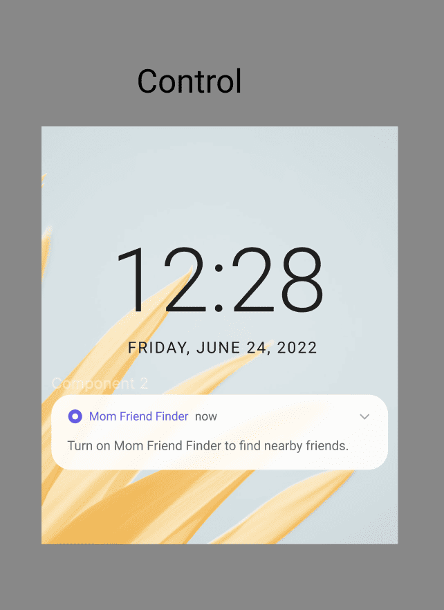
Here’s another made-up example that resembles an A/B test that I ran in 2021. In this hypothetical, we have a mobile app called Mom Friend Finder. This app helps connect mom friends who have opted in to receive push notifications whenever other mom friends are close by.
The existing control copy is performing below company-wide standards, so I was tasked to revamp the copy. Given we would launch these messages to millions of users, we took this opportunity to A/B test different product benefits and gauge performance.
Here’s the existing copy:
And below are a few variants that we tested. Which one do you think performed better?
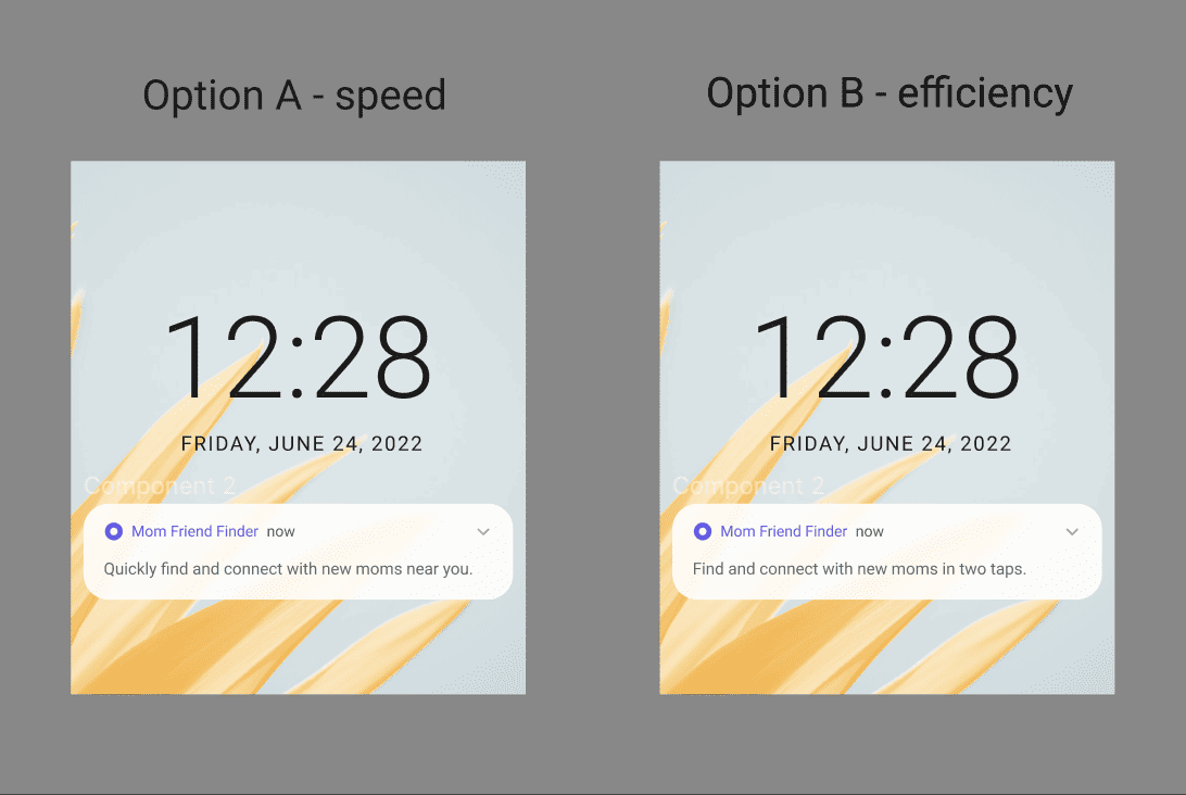
Option A! It edged out Option B by 5%, but they both outperformed the control copy.
I want to call attention to a couple of things here. One, each variant has a tightly focused angle. Option A focuses on the speed of connecting with nearby moms mainly with the word “quickly,” while Option B focuses more on efficiency with the phrase “in two taps.”
When you look closer, the two variants are actually pretty similar. What differentiates them are those small tweaks, which turned out to make a big difference in performance. Those tweaks also helped our post-test analysis much easier because we learned very clearly that our audience cared most about speed over other benefits that we tested.
How do you spot opportunities to test UX copy?
If you’re considering pitching an A/B copy test to your team, consider auditing your existing product for opportunities.
Given the typical user’s reading patterns, start by reviewing these key areas:
- Titles, headings, and subheadings, and
- Buttons with calls to action, or CTA
- The first few words of a key paragraph
When you’re re-reading this copy, ask yourself:
- What’s the current clickthrough and conversion rate of this screen?
- Is there room for improvement?
- If so, is there any copy here that doesn’t follow content design best practices: simple, straightforward, and clear?
- How would I rewrite this copy?
- What expertise can I use to inform better copy?
Summary of takeaways
- People do read: Let’s stop perpetuating the myth that people don’t read. The truth is, they do read. They just don’t read things word for word. Rather, they scan.
- People scan in different ways: Many readers scan in certain patterns where they focus on certain UI elements such as headers, CTA buttons, and the first few words of copy.
- Small changes can lead to big results: UX copy or microcopy is inherently tiny. But given their prominence on our tiny mobile screens, they do matter. And even small tweaks in copy can lead to big improvements in user experience and business outcomes.
- You can A/B test copy, too: If you’re considering pitching an A/B copy test to your product team, start with an audit of your product experience by understanding how it’s performing and ways you think it can be improved.
Lily Rutman is a Senior UX Content Design Lead at DoorDash. Connect on LinkedIn!

Learn how to run content testing that improves clarity, supports product goals, and connects content design and UX writing to measurable outcomes.

Get hired: job hunting and portfolio advice for content designers
Join Patrick Stafford, Casey Webb, and Andrew Stein as they discuss content design jobs in 2026 and advice for landing…
 Jun 23, 2026

AI turned the lights on your content
When an agent can't act on your copy, it's not the AI or the writer. It's a decision nobody made,…
 Jun 15, 2026

9 essential AI concepts for content designers
You probably come across these terms all the time, but here's how these AI concepts can help you in your…
 Jun 12, 2026