

This panel was originally recorded via Zoom webinar and transcribed using Sonix.
WEBINAR TRANSCRIPT
Katie: [00:00:00] We have opened the flood gates. Hello, everyone. Welcome. Welcome. Come on in. Thank you for being here. We are really excited to discuss accessibility for UX writers and designers today. We’ll get started here in just a minute. Just want to make sure everyone has a second to join. Looks like we have 100 people in right now, which is awesome. Thank you all for spending the hour with us. We’re really, really excited. As you join, please let us know where you are tuning in from. We’ve got me in Detroit, Bobbie, Kristen, and Thy are all on the West Coast and so we’re really excited to have this global conversation with you all today. Just so that everyone is aware, we are recording this session so we can share it with you after. You can watch it when you want some refreshers or if you want to share it with someone on your team who couldn’t be here. And we are using Zoom’s closed caption functionality. So if you go to where the Zoom panel is with all of the icons, you can toggle on or off captions, which is a great accessibility feature from Zoom. But just know that this is all automated. And so if you catch any typos or errors, this is all machine automated captioning. We will do our best to send a follow-up with a full transcript without any typos. So just a quick note on that. You can use the Q&A function to ask questions. I see that we have 70 chats popping up. So let me take a look at some of those. Hello. We’ve got Mexico, Dublin, Germany, Poland, Brazil, and Switzerland. This is incredible.
Katie: [00:02:05] Like I said, you can use the chat to submit any of your questions. And then there also is a Q&A function. So we will keep an eye on that as well. And just a quick note, we received tons of questions. We are still looking through them as we speak. So if we don’t get a chance to answer your question today, just know that there will be more resources that we can share, more conversations around accessibility, and you can also learn more in our course. I have to give a plug. And so this is a really high-level overview and look at accessibility for UX and content design. So let’s get started here. Today we have Kristen, Thy, and Bobbie from UX Content Collective. You can see their faces on our screen and you can also hear their voices during this webinar. And so Kristen is a content designer and has worked for 15 years in UX at BlackRock and Barclays Global Investors and has co-authored this course. So hi, Kristen. Thank you for being here.
Kristen: [00:03:19] Hello.
Katie: [00:03:20] Hello. We have Thy, who is a content designer, strategist, and instructor at UX Content Collective. Thy has taught ESL and university writing, and she enjoys helping others achieve their goals through inclusive and accessible writing. Hi, Thy.
Thy: [00:03:37] Hi everyone.
Katie: [00:03:39] And then we have Bobbie. Bobbie is the founder and CEO of UX Content Collective, former head of UX Content Strategy for Google Payments, Google Assistant and QuickBooks Online, and QuickBooks Self-employed.
Katie: [00:03:55] Hello, Bobbie. All right, everyone. So just to give you a quick snapshot, we have a little under an hour and this is a lot of great information to cover. So we will take a quick look at our accessibility course, which just came out. We’re really excited about it. We will talk about what accessibility is and why it matters, how people with disabilities use technology. We’ll look at WCAG and an intro to the ADA or the Americans with Disabilities Act. And then we’ll also talk a little bit about what we can do, how we can make a difference, what making content accessible to all can look like, and what those experiences should be. So before we get started, as our marketing person, I wanted to very quickly introduce our brand new course, which covers all of this and more. IF you’re interested in learning more about accessibility in your role as a UX writer or a content designer, this course written by our lovely panelists here is a great, great, great, comprehensive look into accessibility. And so what we want to communicate today is that accessibility is much more than just a single person’s role, and it’s not the job of one developer on your team. It is a comprehensive responsibility of everyone who works in product. And so our course speaks to UX writers and designers. But you also learn how to work with devs, work with your PMS, your product managers to bring accessibility to life, and to really advocate for accessibility from the top down.
Katie: [00:05:43] And so we’re really excited to give you an overview today and to kind of have this conversation and give you an opportunity to ask our authors some questions. And I will say that certification in this skill will really validate and kind of show your team that you take accessibility seriously and are ready to help champion accessibility in your products. So that is my quick course overview, and I figured we would start the conversation today really just level setting, what is accessibility and what does it mean for digital products? And so this definition from the World Wide Web Consortium says that web accessibility means that websites, tools, and technologies are designed and developed so that people with disabilities can use them. So at a fundamental level, accessibility is about delivering experiences that don’t exclude people from using a product or service because of design or development barriers. Right. So it’s our job to really take those barriers away and make content information in our products accessible to everyone. So it’s our responsibility to create experiences that work for all people, no matter their language, their location, what hardware they’re using, what software they’re using, but also their physical and cognitive abilities. And so accessibility is for everyone. And that’s what we’re hoping to communicate to you and kind of keep the conversation going.
Katie: [00:07:27] If you see this in our material or on the Internet, you may notice this shorthand phrase a11y. This is a way to signify accessibility in an accessible way. It’s really short. It’s concise. And so it also looks like the word ally, which is great. So I just wanted to flag that if you notice this in our material, that is what that signifies.
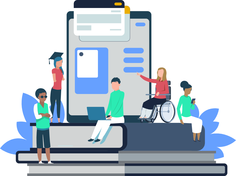
Katie: [00:08:00] And again, if you’re here, if you’re listening to this webinar or watching this webinar, joining us from around the world, you understand that accessibility matters. We don’t need to tell this to you, but I think it’s really important for us to remember that one in seven people have one or more disabilities. To put that into perspective, there are around 7.7 billion people on the planet. And so this is 1 billion, one B billion people who have one or more disabilities. This could be a situational temporary or permanent disability. And this includes auditory, cognitive, neurological, physical speech and visual at any point in your life. Accessibility really is for everyone, and we all can benefit from accessible experiences and design. And so if you’re here, thank you. We really appreciate you. And we’re really excited to have this conversation. With that, I’m going to pass it over to Bobbie, who’s going to kind of take us through some of the business implications for accessibility.
Bobbie: [00:09:13] As content designers or UX designers out in the world working on product teams, one of the biggest barriers that we all know we hit is why should we do this extra work? What’s the point of it? I mean, what? There are three people with disabilities in the world. Do we need to change our whole website for them? That is the worst thing you can hear when you’re advocating for accessibility. We’re trying to push against that. We want accessibility as part of an inclusive approach to making the web usable, making all experiences usable. And when you need to go and make this business case, it’s very important that your stakeholders understand why accessibility is important from your product strategy view and your corporate strategy view. So we know that when we design with accessibility in mind, we just get better user experiences than we would without it. So it’s not three people with disabilities, it’s millions of people with disabilities. And when we work to create accessible experiences, we’re inviting all those millions of people to come and use our products happily and successfully in a way that we want all our customers to feel. It’s the right thing to do. So that’s the last bullet I’m skipping ahead a little here. But the idea is that we really do want to make sure that everyone is invited into our products, and that is how you position your company as a leader in this space. So when we talk about the cost of not supporting accessibility, you’ve now actually tainted your brand. You’re causing frustration for a lot of users. As Katie mentioned, a lot of people have temporary disabilities.
Bobbie: [00:11:10] It doesn’t need to be a permanent disability. So when we design our websites to really accommodate everyone, we’re doing all that work to make sure that everyone can use our products. You’ll expand your audience. You’ll make more money. I mean, let’s face facts. When you’re talking to stakeholders, you want to talk about growing your audience, expanding your reach, and increasing revenue. So these are all of the sorts of stakeholder-related language concepts that we want to share, and that’s the way you’re going to push through advocating for accessible design.
Bobbie: [00:11:48] So we just wanted to cover that, and make sure you had your toolkit for how to talk to stakeholders. The biggest reason that we want to make sure that our websites are accessible is illustrated by this curb cut effect here. What happened was when the ADA Act came through and sidewalks were required to have ramps for wheelchairs, it actually improved sidewalk accessibility for the entire population. So we know that when we design accessible experiences, we’re improving accessibility for everybody across the board and we’re just creating better designs. So that’s why accessibility is important.
Bobbie: [00:12:36] It’s also a team sport. In our course. We’ve geared it principally to content design, information design, UX design, but we wanted to make sure that we share out that everybody on a product team, product managers, visual designers, UX researchers, your legal team, your customer support team, everybody needs to have an accessibility mindset in order to support accessible products. And the course does talk about sort of how these different roles play into getting accessibility over the line.
Kristen: [00:13:25] So how do people with disabilities use technology? In a broad sense, you can just call it assistive technology. But there are two different kinds. Assistive technology and adaptive strategies. So assistive technology, AT, would include hardware like screen readers, speech recognition software for speech input, braille devices that translate text into the Braille dots on the keyboard, and eye-tracking devices where you can point your eye to places on the screen to move your inputs.
Kristen: [00:14:13] And adaptive strategies are built into platforms and browsers. So that’s screen magnification. You can reduce your mouse speed to not have inadvertent clicks. You can turn on captions, of course, and you can also set your color and brightness settings for people with low vision or color vision deficiency.
Kristen: [00:14:42] WCAG is the Web Content Accessibility Guidelines. These are an evolving set of guidelines and checkpoints for making all digital products accessible. The way they are written kind of seems to be more focused on the web, but it actually is meant to be technology agnostic. So it applies to all technology, web, mobile, and mobile apps.
Kristen: [00:15:14] And WCAG is actually the global standard for accessibility guidance. Where the ADA is a little different from WCAG, it is a civil rights law in the United States. It broadly prohibits discrimination against people with disabilities. They just recently, actually in March, cited WCAG as one of the standards for guidance on how to make digital content accessible. They also acknowledge Section 508, which is for government sites. But basically, it’s been cited in a lot of cases and lawsuits, and it’s pretty much the gold standard for accessibility guidance. And it’s in the process of evolving every day.
Kristen: [00:16:15] So we’re going to talk about the core principles. There are four overarching principles for organizing all of the different guidelines. So the first principle is perceivable. The second principle is operable. Then we have understandable and robust. And we’re going to talk about each one a little bit and show an example.
Kristen: [00:16:42] So perceivable involves alt text, alternative text for images, close captions for videos, and visual contrast for people with low vision or color vision deficiency. Text alternatives are basically descriptive text that you attach to images and the code and an alt attribute. They can also more generally be descriptions—the body copy and the image caption—anything leading up to or setting up the visual that is in text format so that it can be read by a screen reader or translated into braille.
Time-based media is a guideline that actually refers to audio and video, so that is video captions, audio transcripts, audio descriptions of actions happening on the screen along with the captions. So anything audio and video related. Adaptable is again, it has to do with providing text alternatives, but also organizing content in a logical structure so that it’s accessible to assistive technology. And distinguishable really just means having things visually stand out. So using enough visual contrast so that people can read text, they can see controls, so that things don’t blend into each other so that you can’t distinguish where to find things and you can see your content hierarchy so you know what to do.
Thy: [00:18:36] One example of this is making sure that the text and the background have the proper color contrast ratio you can see before this. For some of you, it might be readable, but if you have a cognitive disability, some type of temporary or permanent visual impairment, or impairments due to aging, it might be a bit more difficult for you to read. So you can see in the after we’ve adjusted the color contrast ratio to make it stand out a bit more. Right.
Kristen: [00:19:12] Operable is the next principle. This involves writing descriptive headings and labels to support keyboard navigation and speech input. So basically when people navigate with a screen reader, we need to make sure that there are labels for everything, that things are clear, and that they’re not vague. Often they’ll just navigate through links. So links need to be very clear so we know where the link will take us.
Headings also are another separate item, someone might scan the content just by reading headings. It’s very important to have headings to make sure that they’re in the proper hierarchy with H1, H2, and H3, and that they are descriptive. So people can decide if they want to read the content under each heading, and that enables people to scan. And with inputs,of course, fields need to be labeled properly. So if people want to focus on a field or select a field and input into it, it should match the label on the screen in the code so that they can just say the name and it’ll put them in that field.
Other things in this principle involve giving people enough time to complete tasks like forms. Not having excessive animation or flashing that might cause physical reactions. Also giving people the ability to turn off animation or any sort of rotating content and also supporting all different kinds of inputs. So as I mentioned, speech input, keyboard input, mouse input, making sure all fields accept all types of input.
Thy: [00:21:22] Right. So useful design is operable in this case, in the form fields here we only have placeholder text. And one issue with that is that screen readers don’t necessarily read that aloud. It’s also problematic for people with some cognitive disabilities because they might not be sure once they start typing what that field is actually about. So that’s one reason it’s really important that you include meaningful headings and labels for each space. And ideally, we would actually include some helper text below the form field as well, so that they’re clear on what the format of their name should be, the format of their email address and phone number as well.
Katie: [00:22:05] Great thank you. And yeah, everyone, as we’re going through these examples, if you have any questions or ideas, feel free to drop them in the chat and we will we’ll have that conversation in the chat as we go through it as well.
Kristen: [00:22:22] All right. Now we’re talking about understandable. So understandable content means that we use plain language, simple layouts, and supportive microcopy. The guidelines under this principle are readable so that they cover plain language. It also means giving definitions for, if you must use jargon, give definitions in line or in a tooltip. Watch out for acronyms always, of course, the first time. Spell out the acronym and maybe even on every page. First time on the page.
So and then as far as simple layouts and predictability, we want people to not have anything unexpected happen. Have a logical structure like we were talking about in the previous principle and operable. And the interactions are predictable and we don’t have things happening unexpectedly. There are standard interactions that people expect. And Input assistance is like we talked about before with the form fields giving guidance copy and guidance copy is needed or help text for how to fill in certain form fields. Giving accurate error messages, very clear and accurate error messages, that tell you what the error is and how to fix it. And just helping people get through forms without any errors.
Thy: [00:24:12] And a great way to do this is to break down some of the content. So rather than looking at a wall of text, we can actually divide this up into a lot of simplified paragraphs. Phrases. Your paragraphs can even be as short as one or two sentences. When appropriate, we can also add like bullets or even like a one, two, three, four sequential logical ordering. As well.
Katie: [00:24:39] Awesome. And before we move on to the next section, I actually had a couple of questions come through the chat I would love to cover before we go on to the last robust category. Lauren had asked, curious about your thoughts when it comes to disabled buttons? Typically they don’t have high contrast and I’ve always felt like they could be missed if somebody has a disability. But at the same time, I question if they need to see it. I go back and forth all the time. So I’m just curious about your thoughts on that use case.
Bobbie: [00:25:15] In general, disabled buttons can be confusing for anybody. So this is also related to cognitive disabilities as well as color/low color contrast. If somebody doesn’t know why a button is disabled, you’ve just created a large amount of friction and visibility problems. So a lot of times what happens is you maybe have a form that somebody is working through and they get to the bottom and the buttons disabled and you don’t know why. And there might be an error message that’s up at the very top of the form that is rolled off the screen and you can’t even see it. So as a user, you’re going through a form and you don’t even know why this button is disabled. So in general, I would recommend putting a little micro copy error message above your button that’s disabled. Explaining why it’s disabled. There’s a proximity principle for error messaging to make sure that your error actually appears close to where it happened, but also in the most relative relevant contextual area. So that’s my $0.02 on that, Kristen.
Kristen: [00:26:26] Another thing depending on the button is it could be using progressive disclosure. Like maybe you don’t have to show the button until the person actually needs it. So sometimes, like, I would think Bobbie’s case would be right if it’s something that we want the user to know that it’s there and it will become active at some point but includes a message to some guidance copy to that effect. Or if they don’t need to know yet, then just don’t show it to them and show them once they select something that would activate that button.
Bobbie: [00:27:07] Gemma and Marnie also suggested putting a hover text on the disabled button. So a little explanation of why the button is disabled. So when you hover over it, you can see the explanation. A great suggestion.
Katie: [00:27:21] Yeah. And just to add too, I think what Pearl said, disabled (in this case) is pretty vague language and not particularly inclusive. And I agree. I think as an industry, we can definitely come up with another solution for that. That use case. Awesome. And we’ll get to more questions at the end. We want to make sure we have time to go through all of this. So next, we’ll cover robust experiences.
Kristen: [00:27:48] Yes. So the last principle is robust. This is basically addressed by developers and it’s pretty much the foundation, I think, of all the other principles. Right. Because the code is the foundation of accessibility. The code needs to match and represent what sighted people see on the screen. So the code needs to be in a logical order. Developers need to use semantic HTML, follow coding standards because the code needs to interact with AT. And AT developers are counting on that digital content developers are either following website coding standards or mobile platform coding standards.
We do not go deep into robust in the course. Actually because it’s so foundational, we mention code things here and there throughout, but it’s really more about knowing how to talk to your developers and how to provide them with the information they need. And in most cases, that’s going to be meaningful labels for controls, anything that’s not a standard HTML control or anything on screen that doesn’t have a visible label, just making sure that the developers know to put labels on those controls.
Katie: [00:29:28] Robust qualities are generally addressed by our dev partners. So we don’t go into a ton of detail in the course on robust parameters, but you can obviously look into the guidelines and do some Googling as well for your dev friends to help them out. Great. All right. So now we are going to do a little exercise with Bobbie. We’re going to see if something’s accessible and kind of chat in the chat what share our thoughts. So, yeah, Bobbie, I’ll let you kind of take this section away.
Bobbie: [00:30:04] Yeah. So we thought we would make accessibility fun. So this is a quiz for you. See how much you’ve been paying attention. See how much you’ve been doing your accessibility homework. If we look at this example here, give us some chat, chatted on up what is accessible or inaccessible about this little dialogue. If you came across this in the real world and you were looking at this as a content designer, what’s wrong with it? Yeah. What would you do to change it? What do you see? Oh, look at them all coming in. Yes.
Katie: [00:30:44] And if you are if you’re listening to the webinar, you will see a dialogue that asks, did you enjoy your experience today? And we have two buttons on the one up top features a smiling emoji, and the one on the bottom is an angry emoji, and they’re positioned on a green button and a red button. So that’s just some context for those listening in today as well.
Bobbie: [00:31:09] Yeah. Okay, so you guys are nailing this. Everybody is just jumping all over. This is perfect. So. So we have. I love this comment. Only two options. How about a range of emojis? So that was from Jess. And a lot of people are pointing out that emojis by themselves are not inherently accessible. We have a great video in the course shared by a woman who is visually impaired, and she talks about how emojis work for her and how she experiences them. So that’s really cool. So great. Oh, my gosh. Tiffany just mentioned the big teeth. Smiling from localization and cultural perspective might not work. Those big teeth might seem weird in some cultures. God, I love this. This is so good.
Bobbie: [00:32:17] This is great. And we’ve got the red frowny face on a red background, which is just sort of painful. And of course, the very, very obvious, there are no words for a screen reader to actually articulate and explain what the heck these buttons are, even answering what’s on the buttons? What do they mean? So you guys nailed this one. I love, love, love all of these answers. This is fantastic. Let’s move on to our next quiz.
Bobbie: [00:32:51] Are animations accessible? That’s a good question. And that’s actually maybe I’ll let Kristen take that one. It depends how well you explain what’s happening in the animation. They’re not inherently inaccessible per se, per se.
Kristen: [00:33:05] Yeah, they can be captioned. I’m not sure if they mean, just because we say “animation” for like parallax and scrolling or just slight image animations, things like that. There is a guideline that asks to allow people, if you have those types of features, to have a setting to turn those off because some people are just very distracted and annoyed by moving things on the screen.
Katie: [00:33:38] I love the chats for this one. For context, this was an actual website for a television show, right? Am I? I think I Googled it and I was like, what is this disco dancing game? So this was a real website out there.
Bobbie: [00:33:53] Yeah, these. Yeah, this is a real example. And you guys are nailing again. The topography is terrible. So hands down topography is just offensive.
Kristen: [00:34:06] Even for trying to be decorative. It’s just. Yeah, yeah.
Katie: [00:34:12] I do think this was from like the early 2000s though, so I’m sure this was probably trendy at the time. I was going to say to somebody brought it up. Unclear which circles correspond to what labels.
Bobbie: [00:34:25] Yes, that’s right. That’s right.
Katie: [00:34:28] And I think he danced around. So that’s another like the flashing is a no, no, no.
Bobbie: [00:34:36] Yes, exactly. So. So this one’s a good time. We could probably just talk for days about how awful this is. It’s not even moving. We’re not even interacting with it. We’re just looking at it and it’s still awful.
Kristen: [00:34:51] Even if it’s keyboard operable, it probably isn’t.
Katie: [00:34:57] I love that Nina (in the chat) said cognitive load as well. I think there are a lot of websites out there even right now that really overwhelm me with all of the button options and headers and dropdowns and pop-ups. And so yeah, cognitive load is also a really important thing to think about with.
Katie: [00:35:19] Alright. This is is bad. I’m going to spare us. So this was actually something I saw Rachel McConnell tweet today and I thought we could discuss it. It wasn’t in the context of accessibility. It was more of like, what’s going on here? There’s just a lot of random iconography that doesn’t really relate to what the header is. But I thought this could be an interesting discussion and we’d love to hear your thoughts on the chat. What’s going on here? Yeah.
Bobbie: [00:35:56] Let us know that you agree to cookies. We don’t want to know if don’t agree to cookies. We just want to know that you do agree to Cookie.
Katie: [00:36:04] Oh, I didn’t even notice that. What if you said no? No.
Bobbie: [00:36:10] Not really allowed to say no. You just agree to cookies. Let us know. You agree. Oh yeah. So lots going on here or Kristen, would you guys like to chime in?
Kristen: [00:36:29] Well, just the menu with, some have icons, some don’t have icons. I don’t feel the icons are really helping. It’s just yeah, it just makes it look very random and hard to read. And I would like to say briefly, BBC is actually, this is kind of surprising because they’re known for their accessibility efforts and guidance in the UK. They actually have very decent accessibility guidelines that they share. So something’s going on here with this. But that’s the thing. You know, it’s an ongoing, evolving process. It’s very difficult to get perfect and everybody’s doing their best.
Katie: [00:37:14] Well, it looks like, too, this might be like a mobile app screenshot, so I don’t know, maybe they’ve really nailed their website, but their app needs some love. That’s just a hypothesis.
Bobbie: [00:37:26] An interesting thing when you look here that Kristen was just alluding to, we talked about accessibility, being a team sport. So as a content designer or UX writer or UX designer, you guys can learn all about accessibility. The important thing will be to advocate for it across your teams and especially advocate up to stakeholders. So T has an excellent story there that we probably can’t get into today, but he did a really great job pushing accessibility at her company. Tj Do you want to speak to that at all?
Thy: [00:38:07] You know, I will get to that in a few slides.
Bobbie: [00:38:12] Oh, great. Okay, cool. Perfect.
Katie: [00:38:16] Awesome. Well, those are just a few examples. And like Kristen said, we are all doing our best. Accessibility is progress, not perfection. And so just making sure that the organizations learn best practices and start to implement them and advocate. And so we want perfection across the board, of course, but we’ll take progress any day. And so now we’re going to get to some of the questions that you submitted. We received a ton. So like I said, we’ll do our best to get through these, and then we’ll try to save some time for any additional questions as well. All right. So I believe Kristin is going to help with this one. What are the most common mistakes people make in balancing content, goals, and accessibility?
Kristen: [00:39:13] Okay. So according to WebAim’s 1 million study that they do annually, the most common auto-detected errors are low contrast text, missing all text for images, empty links or missing form field labels. Three of those things arguably fall in the content design area. And so basically instead of balancing your goals with accessibility, let’s just make accessibility a content goal. Put clarity and usability first. And again, in all of this, all of those things you can see, different roles play a part in getting those things right. So it’s very important to develop standards and share them with your design, dev, and especially content publishing teams. They’re often overlooked, but they have a lot of power, especially when it comes to content management, using content management systems, providing feedback on the content management system, and inserting alt text. Sometimes that’s just overlooked and it’s like, “Oh, the publisher will throw something in there.” And they need to know some guidelines for how to write descriptive alt text.
Katie: [00:40:43] Anyone have anything else they want to add or we’ll go to the next question.
Bobbie: [00:40:48] I just want to add that content designers, that part of the reason we developed this course is that content designers, along with your UX design partners, can have a huge impact on fixing this stuff. So that’s why we’re so happy that you guys are all here and we can all start advocating for this across the board.
Kristen: [00:41:10] I think you’ll find, too, that content publishers are more than happy to help out. And because they’re the primary users of the CMS and the CMS delivers the product. Right. So it’s good to talk with them a lot as that kind of the gatekeepers of your content.
Katie: [00:41:30] Yep. Great. Then the next question we had was around the top three changes I can make for a positive impact on accessibility as a content designer. So I know we’ve kind of talked about this already, but if we wanted to just kind of talk through the three main areas that we can start impacting now.
Thy: [00:41:52] Right. So one way that most of you are actually already doing, if you’re a content designer, is writing meaningful headings. That’s something like we is really a UX writing best practice. And within accessibility we really think about what is the main message, what are we trying to really communicate here? And how can we make it as clear and concise as possible with plain, simple language?
As far as links go, we’re trying to make this shift from a generic learn more type link to something that has a bit more meaning, and it sets the expectation for the user so they get a sense of where this is going to take them. So rather than saying like learn more, it could learn more about accessibility. And when they click on that, they know that they’re going to be redirected to a space that allows them to get more content in that area. And then as far as buttons go, we also want to make sure that our CTAs communicate clearly what action the user is about to take or what they’re confirming, whether it’s agreeing to these cookies or whatnot. No cookies. I don’t want your cookies.
Another way we can start making a difference is really thinking about the descriptive text rather than just something simple. Like woman with child, we can get a bit more descriptive if that has meaning and adds to what we’re trying to communicate to the user. And then one thing that my team started doing a lot is to just ask if accessibility has been considered. As you’re starting out in your accessibility journey, you can really just bring that to the table. Whether you’re really strong and know everything about accessibility or not, you can just ask your design team in a review. Has accessibility been considered? How might this be read by a screen reader? What’s the user hearing as they’re interacting with the product?
Katie: [00:43:53] That’s great. Yeah. And I think to all the points that you mentioned communicating to content creators as well, I think as someone who has worked in social media marketing and some of the content that I’ve created, I’ve run through screen readers and realized these emojis are absolutely adding no value. And using them to replace the word, I’m completely changing the meaning of this email header, for example. And so I just think that that’s a great, great way to say, you know, run it through a screen reader, test it using an alternative method and just see how how it translates. I think that’s great. Somebody in the chat had asked, How do you provide the alt text to your dev team? And so I’m just curious if the team here has any just really quick recommendations. You work in Google Docs, is it in Figma? Just a quick, quick way of working to hand off that alt text.
Kristen: [00:45:02] Yeah. I mean, it’ll probably be different in every company and it’ll depend on your process, but in the design software is great and Figma is great. We actually have a section in the course on accessibility annotations that shows how to annotate the designs to include accessibility labels and alt text. Some people developed a really cool system with icons for tagging designs, for annotating designs for that. And so yeah, I mean, it’s basically knowing who is inputting the text. If it’s an app, it’s going to be the dev team, probably. If it’s a website, it’s going to be the content publishers. But really including it as early in the process, the person who’s actually writing the copy ideally would write it because they’re also writing the surrounding copy. It’s all very nuanced. And there’s a copy doc and annotate design files. If dev needs a spreadsheet with all the labels in a matrix, then do that.
Katie: [00:46:25] I love this question for Kristen. What is your take on third-party accessibility overlay platforms like accessiBe? Do they do more harm than good? And just to kind of provide more context for people who aren’t familiar with accessibility overlay tools, there are third parties that you can kind of if you’re looking at my screen, you can see there is a tooltip that basically says, explore your accessibility options, you tap it and then you can kind of toggle on or off what you want based on your experience. But those have been seen to be a bandaid on the solution, right? Because you’re not addressing the source code, you’re slapping on the overlay. So I’m curious your experience with these tools and if they’re worth looking into in the short term. Just curious your thoughts there.
Kristen: [00:47:18] Yeah. I mean, I would advise avoiding them, even if it’s supposed to be a quick fix. It’s been shown that having one can actually increase legal risk because it’s kind of like an admission that you haven’t addressed your process and policies to support accessibility. It’s really a band-aid solution. Also, users just prefer to have control over their settings. They have the settings that they’re used to. They’re used to navigating and operating the way they like to. And they’d rather just have the thing work than have to learn how to use this weird overlay that they’re not accustomed to. And also, there are privacy concerns. If it’s an overlay that’s supposed to help with screen readers, it’ll try to detect if you’re using a screen reader. Some people don’t like that. They don’t. And it can also, like, turn something on. And then when you go to another site, it’ll stay on for that. People feel very, you know, it’s just not good. And in the disability community, the overall response is negative. So if you Google overlay fact sheet there’s actually a site that a group put together, that’s also a petition to say, please, no more, no more overlays.
Katie: Kristen, I believe you’re going to help take this next one. How much of design or assistive technology knowledge do we need to know to get started? Are ARIA labels the responsibility of content designers? So can you explain what an ARIA label is and then get into this question?
Kristen: [00:49:39] So ARIA is a set of attributes that augment semantic HTML. So when developers are developing custom components, when they’re not using semantic HTML or platform standard code, then they may need to rely on ARIA. And there are a lot of different attributes for setting what the role is, the state, and the value—that’s covered in WCAG. The role is basically what is it? Is it a button? Is it a form field? It’s things like that. So the proper use of ARIA can get complex and it is the developer’s responsibility because they have to balance that with their general coding standards. It’s basically how they code their app or the website.
But content and interaction designers are responsible for making sure that controls have accessible names, that they make sense. So there should be a system worked out with, if there’s a visible label, of course, that should be the label. It shouldn’t be something different. If for some reason there’s not a visible label, then it’s good to have a system like we were saying with annotations, to let developers know what the label should be. So that’s ARIA.
Katie: [00:51:13] Great. And then how much do web design or assistive technologies required to get started?
Kristen: [00:51:22] Well, I’m saying curiosity and commitment are more important when you’re getting started, when anyone gets started with anything. How much do they know? So start small. And you’ll find that I’m still learning today. Everyone. People have been working in it for years and are still learning things today. Technology evolves. Assistive technology evolves. So the best way to start is to just get in there, navigate with the keyboard, take a course. You know, use your phone screen reader, talk to friends and family. Talk to your grandparents or older people in your family about how they have had any digital experiences, like ordering prescriptions, that were difficult for them. Why was it difficult? Just yeah, just be curious and get out there and learn and then just try to apply it every day. A little thing makes a big difference.
Katie: [00:52:26] Great. Thank you, Kristen. What solutions are recommended for neurodiversity? Making content accessible to someone with a learning disability? So we’ve kind of talked about this a little bit, so I figured, Kristen or Bobbie or Thy, I can’t remember which one of you wanted to jump in here, but open to any suggestions you have.
Kristen: [00:52:56] So neurodiversity is basically, let’s respect people’s needs again, focus on usability and clarity. Those are the key aspects of accessible design. So we talked about giving people enough time to complete tasks. If there has to be a timer like maybe people have experienced those when you’re logged into your banking account or something, make sure there’s ample warning and they have a chance to stay on the task. Say, I’m still in here, I’m still working on this.
Don’t interrupt people with notifications and alerts unless they’re important to the task at hand. Just be considerate of those things. Give people control whenever you can. So if there’s any rotating and animated content, I mean, animations are kind of still popular. The rotating carousel, thankfully, is pretty much going out of favor. But if there is rotating content, people need to be able to stop it, have a pause, stop or hide button so it’s not up in their face.
Using plain language, clearly structured content, clear typography of course, large enough typography. Even though people can enlarge, we don’t want it to be too tiny. Visuals are actually good as they help people. It’s just an alternative way to convey information, right? Some people like visuals, so as long as there’s enough descriptive text to set up the visual or in the text, then visuals are great. And always think about how you can give people guidance for tasks and clear error messages so they know when things go wrong and how they can fix it.
Katie: [00:55:02] I think, Bobbie, this last question is for you on accessibility regarding chatbots and voice.
Bobbie: [00:55:09] Yes. I just wanted to make a quick plug here for anybody who’s working on chatbot and voice interfaces. I actually ranted about this on a whole article on Medium probably a few years ago, but when we are looking at voice interfaces, try to make those accessible as well. And right now when we look at how to get onboarded to voice interfaces or chat interfaces, you often need to be sighted, for example, even to understand how the voice experience connects to the app experience. A lot of times you’ll have to do physical setup steps in an app before you can use a voice experience. So this is just my plug to make sure if you are working in voice or voice UX to make sure that you’re thinking of accessibility as well.
Katie: [00:56:10] Awesome. We have more questions in the chat. Unfortunately, we’re very limited on time, so any other questions? We have one minute, so I’m just going to pick one at random. Somebody had asked, how do you address accessibility concerns around tooltips? Bobbie, I don’t know if you want to take that one?
Bobbie: [00:56:29] Actually, I’m going to throw that one at Kristen.
Kristen: [00:56:35] Accessibility and tool tips. So usually tool tips are accessed by a question mark icon. Yes? Or whatever your tooltip icon happens to be. That icon would need to be in proximity, in the right place. So in a logical order where if someone could Tab to it, then it would have to have the correct label. Like more information or something very clear that they’re getting more information on this field that they’re in. And then, the focus upon clicking, that would have to go to the tooltip so that either if someone’s keyboard navigating it would pop it up or if it’s a screen reader, the screen reader would then go into it actively and read the tooltip for the user.
Katie: [00:57:32] Awesome. Great. I just want to thank everyone. Thank you for your questions. Thank you to Bobbie, Kristen, and Thy for joining us. And just very subtly want to plug as our marketing person that we have our accessibility course which is written by the lovely ladies in this chat. If you’re interested in learning more about what you can do as an accessibility advocate on your team and how you can get your team involved, the course is a really comprehensive, deep dive into all of the WCAG guidelines and how they apply to your role and your work.
Katie: [00:58:25] Feel free to find us on LinkedIn, on Twitter, on social media. You can connect with us if you have more questions, if you want to talk about accessibility. WCAG, all the good stuff. I saw a tweet recently that said like, “POUR some WCAG on me.” Like the POUR method. So if you want, you want any accessibility puns.
Bobbie: [00:58:46] We are here for you.
Katie: [00:58:50] This is one of our most registered webinars and so it just goes to show that accessibility is on our brains. We’re constantly thinking about how we can advocate for it. You’re interested in advocating for it. So the fact that you’re here, you’re making that first step. Now we go do the work. Let’s do the things.
———————————————
Meet the guests

Kristen McConnell, UXCC
Kristen is a content designer and writer, currently working with UX Content Collective as an instructor and learning management system (LMS) editor. She was a lead UX designer for BlackRock and content publisher for Barclays Global Investors, focused on iShares ETFs. She has over 15 years’ experience using design thinking and UX principles to develop accessible websites and apps.

Thy Nguyen, UXCC
Thy is a content designer, strategist, writer, and lead instructor for UX Content Collective. She taught ESL and university writing and provided language support to art and design students for several years. She’s skilled at explaining complex topics in language that is inclusive and accessible, and she enjoys guiding and supporting others in achieving their goals.
Bobbie Wood, UXCC
Bobbie is the founder and CEO of UX Content Collective. She’s also a former head of UX Content Strategy for Google Payments & Google Assistant transactions and a past design & content senior manager for QuickBooks Online & QuickBooks Self-Employed. She’s passionate about improving diversity in tech and is somewhat (very) obsessed with robots and AI.
Our UX accessibility certification teaches how to write accessible content, follow UX accessibility guidelines, and help teams deliver better experiences.
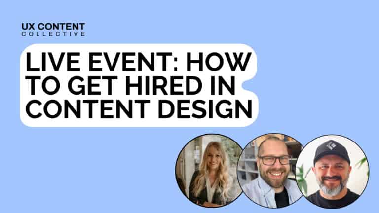
Get hired: job hunting and portfolio advice for content designers
Join Patrick Stafford, Casey Webb, and Andrew Stein as they discuss content design jobs in 2026 and advice for landing…
 Jun 23, 2026
AI turned the lights on your content
When an agent can't act on your copy, it's not the AI or the writer. It's a decision nobody made,…
 Jun 15, 2026
9 essential AI concepts for content designers
You probably come across these terms all the time, but here's how these AI concepts can help you in your…
 Jun 12, 2026
