
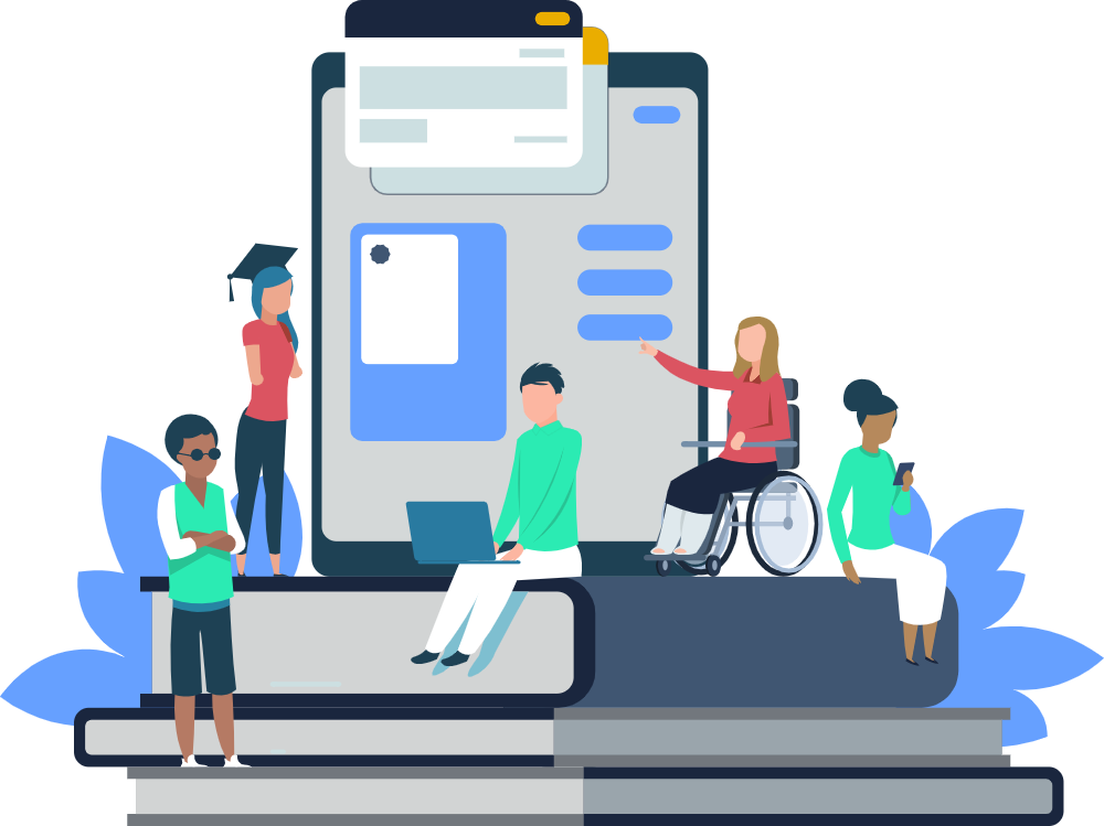
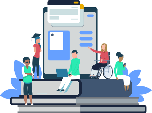
Accessible UX writing: a guide for inclusive content design
Accessibility isn't just about compliance with legal standards or ticking boxes on a checklist. It's about creating inclusive content design that works for real people in real-world situations.

Want posts like this in your inbox?
Join the 12,000+ content designers who receive our newsletters.
Interested in accessibility? Check out our complete guide to accessibility in UX writing and content design.
Accessibility isn’t just about compliance with legal standards or ticking boxes on a checklist. It’s about creating inclusive content design that works for real people in real-world situations.
For UX writers and content designers, accessibility is a shared responsibility. We often focus on clarity, usability, and tone, but those qualities are meaningless if our content isn’t usable by people who rely on screen readers, voice controls, or cognitive aids. The words we choose, how we structure them, and how they interact with the interface can determine whether someone feels empowered or excluded.
Think about someone using your app with a broken arm, trying to fill out a form one-handed. Or an older adult navigating an unfamiliar interface on a new device. Or someone with ADHD trying to complete a task without getting overwhelmed by dense, disorganized text. These are real users. And accessible UX writing is what makes the difference between success and frustration.
Beyond usability, there’s also a business case. Inclusive content design expands your audience, reduces customer support queries, and aligns your product with values of equity and fairness. From a legal perspective, non-compliance with accessibility standards can result in fines, lawsuits, or reputational damage (especially with regulations like the European Accessibility Act).
But above all, accessible UX writing is a matter of respect. It’s a commitment to meeting people where they are, not where we assume they are. And it’s one of the most powerful tools we have for making digital products more humane, inclusive, and effective.
This guide outlines the principles, practices, and mindset UX writers need to create inclusive, accessible experiences through content.
What is accessible UX writing?
Accessible UX writing refers to the practice of crafting digital content that is clear, usable, and inclusive for all people—regardless of their physical, cognitive, or situational abilities. At its core, it’s about reducing friction. It’s making sure that the text in an interface does not become a barrier but instead serves as a helpful, inclusive guide.
Many people assume accessibility begins and ends with code or visual design. But content plays an equally important role. Text that is confusing, too dense, overly technical, or dependent on cultural cues can alienate or exclude users who are neurodivergent, non-native speakers, visually impaired, or using assistive technologies.
Accessible UX writing is about:
-
Clarity: Using simple, direct language that all users can understand
-
Structure: Organizing content in a way that supports scanning, navigation, and comprehension
-
Compatibility: Ensuring the content works well with screen readers and other assistive technologies
-
Consistency: Using predictable patterns so users know what to expect across an interface
This approach doesn’t mean dumbing things down. It means removing ambiguity and designing for clarity—so people don’t have to work harder to understand or complete a task. Good accessible content improves the experience for everyone, not just people with disabilities.
For example, consider a confirmation message like: “You’re all set!” That may feel casual and friendly, but it’s vague. A more accessible alternative would be: “Your payment has been submitted successfully. You’ll receive a confirmation email shortly.” This is more specific, gives next steps, and works better for all users—especially those using screen readers or needing precise feedback.
Accessible UX writing isn’t just a writing technique—it’s a mindset. One that values inclusion and equity, and brings those values into every microcopy, tooltip, and label. It’s not a nice-to-have. It’s foundational to ethical, human-centered product design.
Interested in reading more about accessibility and inclusive content design?
- Check out our webinar recap: Accessibility for UX
- Getting started with writing more inclusive copy
- Classism in UX copy: a coronavirus case study
- Accessible content design for emojis
- The Gender-Inclusive Language Project
Why inclusive content design matters
Inclusive content design isn’t just about helping people with permanent disabilities. It’s about designing for a spectrum of needs, environments, and situations. Everyone benefits from thoughtful, inclusive UX writing—whether they realize it or not.
Consider these everyday scenarios:
- A commuter trying to access a mobile app in bright sunlight, struggling with poor contrast.
- A busy parent juggling a child and a phone, navigating your interface with one hand.
- A new user who speaks English as a second language, attempting to decipher your microcopy.
- A person experiencing temporary anxiety or stress while using a medical or financial app.
In all of these cases, clear and accessible writing can reduce frustration, build confidence, and improve task completion. It transforms a digital experience from one that excludes, confuses, or overwhelms—into one that supports, guides, and empowers.
There are also brand-level benefits:
- Trust: Inclusive content design signals that you care about your users’ real needs.
- Retention: Users who feel seen and supported are more likely to return.
- Reach: Accessible products work better for more people, increasing market size.
- Risk reduction: You’re less likely to face legal issues or PR fallout due to accessibility oversights.
At its heart, inclusive UX writing ensures that the digital world is usable for everyone. It’s a recognition that diversity is the norm—not the exception—and that our content must rise to meet that reality.
Best practices for writing inclusive content
Many designers assume that accessibility is complex. It’s not! Here are some guidelines:
Use plain language
- Avoid jargon and idioms
- Keep sentence structures short and direct
Structure content for scanning
- Use headings, lists, and chunking to organize ideas
- Place the most important information first
Write descriptive headings and labels
- Avoid ambiguous phrases like “Learn more”
- Be specific about actions and destinations
Don’t rely on color alone
- Support visual cues with text or icons
- For example, error states should include a message, not just red coloring
Write helpful error messages
- Explain what went wrong and how to fix it
- Avoid blame or frustration-inducing language
Be mindful of cognitive load
- Break long flows into steps
- Use progressive disclosure for dense information
Consider language localization early
- Design for languages that expand or contract in translation
- Avoid culturally specific references that may not translate well
Accessibility principles for content (POUR)
To design content that’s truly accessible, it helps to ground your work in a framework. One of the most widely recognized is the POUR model, developed as part of the Web Content Accessibility Guidelines (WCAG). POUR stands for:
-
Perceivable: Users must be able to perceive the information being presented, regardless of the senses they rely on. For content, this means ensuring that text is readable, visual cues are supplemented with text, and multimedia includes captions or transcripts.
-
Operable: Users must be able to navigate and interact with the interface. From a content standpoint, this means that all labels, instructions, and feedback are clear and actionable—even when accessed with keyboard navigation, screen readers, or voice commands.
-
Understandable: Content must be clear, predictable, and consistent. Avoid jargon, use plain language, and maintain consistent labeling and structure. Users should not have to guess what a button does or where a link leads.
-
Robust: Content must work reliably with a variety of technologies, including current and future assistive tools. Writers can support this by avoiding placeholder-only instructions, using semantic HTML (in collaboration with devs), and ensuring that content doesn’t break when layouts shift.
These principles aren’t just for developers or designers. They provide a powerful lens for evaluating and improving content as well. When UX writers adopt the POUR mindset, accessibility becomes a design choice—not an afterthought.
Common barriers in digital content
Accessibility issues often arise from unintentional decisions during content creation. Even small missteps in language or structure can create major usability problems for people relying on assistive tools or navigating challenging environments.
Here are some examples of common barriers:
- Ambiguous link or button labels: Phrases like “Click here” or “Read more” offer no context when read out of sequence by a screen reader. Labels must clearly describe the destination or action.
- Placeholder-only form instructions: When guidance disappears as the user begins typing, it becomes inaccessible to those using screen readers or autofill tools. Instructions should be persistent and visible.
- Overuse of jargon or figurative language: Complex terms, cultural references, or idioms can confuse non-native speakers or neurodivergent users. Simplicity supports clarity.
- Color as the only indicator: Interfaces that rely solely on red or green to signal status create problems for users with color blindness. Supplement color with text or icons.
- Inconsistent or unpredictable labels: Changing terminology or UI labels across different screens erodes trust and causes confusion.
These patterns can create friction for any user—but they are especially harmful to people who already face barriers to digital access. Content designers are uniquely positioned to remove these blockers by identifying weak points in a flow, adding redundancy to key information, and ensuring clarity in high-stress contexts (like error messages or security screens).
Being aware of these barriers—and knowing how to prevent them—should be standard in every writer’s toolkit. Accessible content isn’t something that’s layered on after the fact. It’s baked in from the first draft.
Interested in reading more?
- Equitable hiring in UX writing
- Compassion in UX: a hospital case study
- Tips for gender-inclusive translations
How to design content with accessibility in mind
Designing accessible content is an ongoing practice, not a one-time task. It involves asking the right questions, collaborating across disciplines, and making intentional choices that serve a broad range of users. Here are some key strategies to implement.
- Use plain language: Write in a way that’s easy to read and understand for as many people as possible. Use short sentences, familiar words, and active voice. Avoid idioms, metaphors, or region-specific expressions.
- Support multiple modes of understanding: Complement text with visual cues (like icons) and make sure any audio or video includes captions or transcripts. This helps users who are deaf, hard of hearing, or accessing content in noisy environments.
- Be consistent: Use consistent labels, phrasing, and interaction patterns throughout your product. Consistency reduces cognitive load and helps users build confidence as they navigate.
- Make action items descriptive: Ensure that all buttons and links convey exactly what they do. For example, replace “Submit” with “Submit feedback” or “Place your order.”
- Break content into manageable chunks: Use subheadings, bullet points, and clear hierarchy to organize content. This supports users with ADHD, dyslexia, or cognitive impairments who may struggle with long, unstructured blocks of text.
- Label forms clearly and persistently: Never rely solely on placeholder text. Use visible labels that remain present during and after user interaction.
- Test with real users—including those with disabilities: No amount of theory replaces feedback from real people. Include users with diverse access needs in your research and testing processes.
Accessible content doesn’t happen by accident. It’s the result of deliberate, informed, and collaborative effort. As content designers, we have both the tools and the responsibility to make every word more inclusive.
Collaboration and advocacy
Creating accessible experiences isn’t something content designers can do in isolation. It requires partnership across product, design, engineering, research, legal, and marketing. Strong collaboration—and a shared commitment to inclusive outcomes—helps ensure that accessibility isn’t seen as a siloed task, but as a team-wide value.
Here’s how content designers can support accessibility through collaboration:
With designers
Help ensure components and flows include accessible labeling, contrast, and hierarchy. Raise questions early about how copy and layout affect usability for diverse audiences.
With developers
Work closely to understand the constraints of implementation and suggest content structures that support accessible code. Help shape ARIA labels, alt text, and semantic HTML when needed.
With researchers
Incorporate accessibility-focused questions into usability testing. Advocate for including participants with disabilities in research panels.
With legal and compliance
Understand relevant accessibility regulations (like WCAG or ADA), and ensure your content follows best practices for risk reduction and ethical responsibility.
With leadership
Elevate the importance of accessibility as a strategic priority. Share user feedback, support data, and examples that tie inclusive practices to product and business success.
Advocacy is part of the job. That means pushing for accessibility reviews in product timelines, encouraging inclusive research, and helping your team see accessibility as essential—not extra. A single content designer’s voice, when consistent and grounded in care for users, can influence entire teams to build more equitable products.
Accessibility is everyone’s responsibility
Ultimately, accessibility isn’t the responsibility of one role, it’s a collective effort. But content designers are uniquely positioned to drive accessibility forward because we’re involved in the details. We write the microcopy that appears on buttons, the labels on forms, the instructions that help users complete tasks. We know how word choice affects clarity, tone, and comprehension.
We also have the tools to help others see the importance of accessibility. When we model accessible content, push for inclusion in research, and build systems that scale, we help normalize accessibility as a standard—not an exception.
Accessible UX writing makes products better. It makes teams stronger. And it makes digital experiences more equitable and human for everyone.
If you’re designing microcopy, you’re designing for accessibility whether you realize it or not. So let’s do it with care, clarity, and intention.
Frequently asked questions about accessibility in UX
What is accessible UX writing?
Accessible UX writing is the practice of creating digital content that can be understood and used by as many people as possible, including those with disabilities. It involves writing clear, concise, and inclusive language that supports screen readers, cognitive accessibility, and a range of user needs.
Why does accessibility matter in UX writing?
Because language is part of the interface. If your content is confusing, overly complex, or full of jargon, it can become a barrier, especially for people with cognitive disabilities, low literacy, or those using assistive technology. Accessible writing helps everyone navigate digital experiences more easily.
How can UX writers make content more accessible?
Some best practices include:
- Use plain language and avoid jargon
- Write short, clear sentences
- Provide helpful context in buttons, links, and form labels
- Avoid metaphors, idioms, or cultural references that may not translate
- Structure content with proper headings and hierarchy
- Test content with accessibility tools or assistive tech users
What’s the difference between accessible and inclusive writing?
Accessible writing ensures content can be understood and navigated by people with disabilities. Inclusive writing focuses on being respectful of diverse identities, backgrounds, and experiences. Both are essential: accessibility removes barriers, while inclusivity promotes belonging.
Do UX writers need to follow WCAG guidelines?
While WCAG (Web Content Accessibility Guidelines) are often seen as a technical standard, many principles apply to writing too such as clarity, readability, and operable content. UX writers should collaborate with designers and developers to meet WCAG, and also apply writing-specific accessibility practices.
How does accessibility relate to voice and tone?
Voice and tone matter for accessibility because overly casual, aggressive, or complex language can alienate or confuse users. Accessible content uses a friendly, clear tone that supports understanding without talking down to people. It’s about meeting users where they are.
Can small language choices really make a difference?
Yes. Even small tweaks like replacing “click here” with descriptive link text can significantly improve accessibility for screen reader users. Removing idioms or simplifying instructions can help users with cognitive challenges. Language is a powerful tool for inclusion.
Create accessible content
Accessibility for UX Writers and Designers
Our UX accessibility certification teaches how to write accessible content, follow UX accessibility guidelines, and help teams deliver better experiences.

Patrick Stafford
Patrick Stafford is the CEO and cofounder of UX Content Collective
More posts by this author

